

If you've read very many of my blog articles, you know I love color. I love delicate subtle shades like mauves and pale greens and soft grapefruits, and I love intense hues like vibrant fuchsia and the cheerful orange of my new Royal Tangerine Sailor 1911. I even wrote a whole blog article called Bonkers for Bright Colors! However, I also appreciate the absence of color... a.k.a. black. There's just something about the crispness and elegance of black. Black tie, black cars, black and white film, black leather... all have a je ne sais quoi that appeals to our sense of style. I feel the same way about black pens, and today I'd like to explore the world of black ink.
Black is Not Black
My pens are inked with a rainbow of colors, and, if I look at the visualization that represents my ink collection, it's a pretty well balanced spectrum. I use the website Fountain Pen Companion to help me keep track of my inks and pens, so I have a pretty good idea of what inks I own and which are my favorites. The Companion allows you to create a profile for free, enter your inks and pens, and even keep track of which pens are filled with which ink. The information about your pens is always private (because pens can be expensive, and you should be careful about sharing your collection publicly), but the ink info is shared unless you make it private. You can also include both public and private comments about your inks, so I like to make notes about any sheen, shimmer, or multichromatic properties the inks may have, and I sometimes add personal comments if one of my pens especially likes or hates the ink. I haven't 100% caught up with entering all my ink bottles and samples, because I like to swatch them first, but I've added over 375 inks to my personal database, so I have a fairly decent list to refer to. Out of all my colors, I only have 15 or 20 black inks, and I don't usually use black ink in more than one pen at a time, but I consider it very important to have a good black ink on hand.

No, there's no reason you have to use black ink if you don't want to, but sometimes I just need to see that satisfying black line on the page, especially if I'm using my pens and inks for art. My teammate Lauren, who regularly sketches and is studying art in college, loves working with black, and I sometimes have to twist her arm to get her to use color. Waterproof black ink is also especially good to use for outlines, in combination with lighter colors that can be used as a wash on top, and store customers often ask me to recommend blacks to them for this purpose.
I'm not a trained artist, but, a few years ago, I invented a fun project for myself where I came up with favorite opera characters to represent the face cards for each suit in a deck of cards, and used fountain pen ink to illustrate how each character looked in my imagination. It was just for relaxation and to express myself creatively, so I didn't worry about whether it was "good" or not, and I made up my technique as I went along. I didn't have any waterproof ink at the time, so I wasn't able to create the crisp lines I later discovered when I experimented with water-resistant inks, but I selected my blacks creatively and combined different ones depending on the look I was going for.
The final ink painting I did was of King Filippo (Philip II of Spain) from one of my all-time favorite operas, Verdi's Don Carlo. Even though the king is a fascinating character, I had been subconsciously dreading that painting, because, historically, he dressed in a lot of black, and I thought it would be a bit depressing and boring to illustrate. However, although I had put it off for last, it ended up being one of my favorite paintings in my whole series. The black wasn't boring at all. I loved the depth of the black inks I used, and how interesting and beautiful the blacks looked together.

Unfortunately, I didn't write down which inks I used, but the point is that black inks can have beautiful properties, so don't dismiss them. A lot of black inks have reflective sheen, and that sheen may be black (Sailor Black), gold (J. Herbin Pearle Noir, Scribo Nero Nero, Namiki Black, Graf von Faber Castell Carbon Black), silver (Aurora Black, Sailor Kiwa-Guro), bronze (Conklin Classic Black), bluish (Waterman Intense Black), purple (Montblanc Mystery Black) or pink (Iroshizuku Take-Sumi). And, when you compare blacks, you will notice that their colors actually vary quite a bit. Black inks can be darker or lighter, warmer or cooler. When you add water to a black ink, you may realize it's actually an extremely dark purple or green. Some black inks show shading, and others put down a consistent and true line. Black isn't just black.
Comparing Colors
There are so many black inks out there, and what makes a black ink "the best" for you is very personal, so I knew I'd never be able to pick the overall best black ink of all time for this article. One person may prefer a softer greyish black that shows more shading, while another wants the deepest darkest black that ever blacked. Some people like a black that leans more toward blue, and others want one that's more red. Some love the beauty of sheen in their blacks, while others feel that it takes away from the intensity of the color and find it distracting. I like a lot of different kinds of blacks, but, when I decided on the topic for this article, I opted to go for blacks that are nice and dark and are highly recommended by users. I don't have in-depth personal experience with every ink I selected, but they are all either inks that I love myself or that have been specifically called out as great blacks.
 (Pictured: my broad nib Sailor 1911S in Royal Tangerine, filled with Colorverse Sunspot, and my double broad Pilot Custom 74, which I always keep inked with Colorverse Shiny Black. Plus, black coffee, of course! I wrote the list with the Sailor.)
I decided to compare the following inks:
- Aurora Black
- Colorverse Sunspot
- J. Herbin Pearle Noire
- Kaweco Pearl Black
- Pelikan Edelstein Onyx
- Iroshizuku Take-Sumi
- Platinum Carbon Black
- Platinum Chou Kuro
- Sailor Kiwa-Guro
I also love Colorverse Project 001 Shiny Black, but this is a glistening (shimmering) ink, so I didn't directly compare it to the others.
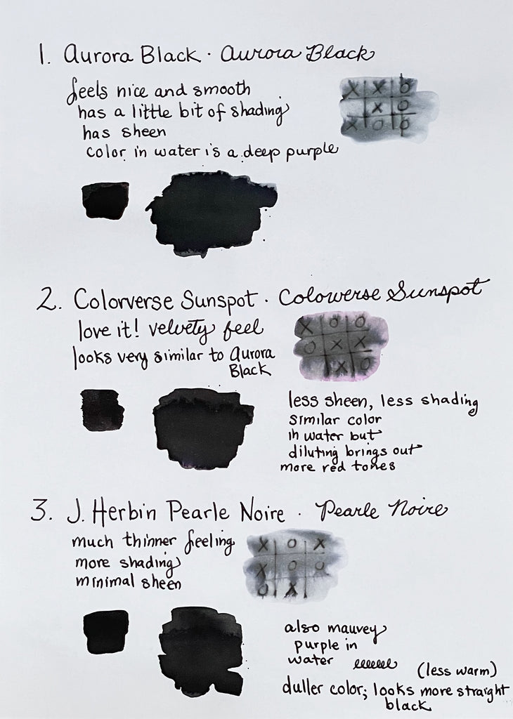
First I painted squares of all nine inks on 68 gsm Tomoe River paper with a watercolor brush to compare their darkness and sheen. I wrote the name of each ink underneath the squares by dipping a fountain pen with a fine nib.
 (I accidentally dripped a drop of water onto the Aurora Black name later. Sorry, Aurora Black!)
The results were very interesting! Platinum's new Chou Kuro is without question the darkest, although comparing it to Platinum Carbon Black, as Platinum usually does, is a misleading comparison. (Platinum describes it as 46.8% darker than Carbon Black.) Platinum Carbon Black, although an excellent ink and very waterproof, is not a particularly dark black because it has a lot of sheen. In concentration, it reflects back quite a bit of light and actually appears almost silvery. Sailor Kiwa-Guro, which is also wonderfully waterproof, is similarly reflective. I like both inks very much, and the ink colors on their own are a true black (not grey), but, because of their high levels of sheen, they are easy to beat in a darkness competition. I will talk more about these three inks later, in my discussion of water resistance and pigment-based inks.
The other six inks are all dye-based, and, like most fountain pen inks, are not especially water-resistant. They all write well and look great on the paper. Aurora black has the most sheen, and Kaweco Pearl Black is the most matte, with no sheen.
One thing that I found very interesting (and beautiful!) when comparing the nine inks was observing how the water looked when I cleaned my brush and pen between colors. Most black inks just look black until you analyze them more closely, but I discovered that Aurora Black, Colorverse Sunspot, and J. Herbin Pearle Noire all turned my water a warm toned mauve-y purple. Accordingly, these three inks look the most warm toned on the paper.
Sunspot is slightly more red than the other two, and you can see the pink ring that spread out from the Sunspot stain on my paper towel in the photo below. The ink pictured in the water is J. Herbin Pearle Noire, from my own small bottle.

Kaweco Pearl Black, on the other hand, is more blue-toned when diluted in water, and created an aqua-colored ring on my paper towel.
 Pelikan Edelstein Onyx and Iroshizuku Take-Sumi are also slightly more cool-toned than the inks in my first row, and both turned my water a beautiful mauve that leaned more on the blue side of purple. You can see Pilot Iroshizuku Take-sumi in the photo below. I love this color!

I would rank Kaweco Pearl Black as the most cool toned, then Iroshizuku Take-sumi, then Pelikan Edelstein Onyx. Next would be J. Herbin Pearle Noire, Aurora Black, and Colorverse Sunspot, in that order.
Pigment Based
The three inks in my last row, Platinum Carbon Black, Platinum Chou Kuro, and Sailor Kiwa-Guro, added very little color to the water and were mostly pure black. I observed a slight yellow tinge with Carbon Black and Kiwa-guro, but none with Chou Kuro. More interesting than the color of the water for these inks was watching how their pigment particles behaved. Here's a closeup of what happened after I dipped my Sailor Kiwa-Guro -saturated brush into the water.

All three of these inks are pigment-based, which means they contain minuscule particles of pigment suspended in the ink formula. They are more permanent than the water- and dye- based inks we most often use in our fountain pens, because these solid particles adhere to the paper and bond to the fibers over time. The downside is that these pigments can cause clogging if allowed to dry out inside of a pen, and can be a little more difficult to wash out of your pen or converter. I have been using a blue pigment-based ink, Sailor Pigmented Sei-Boku (Sailor Pigmented Kiwa-Guro's sister-ink), in my Hexo for over a year and haven't had any problems with it. It hasn't clogged my pen at all, and has, in fact, behaved perfectly... far better than many other inks I've tried.
As I said in my article about water-resistant inks, I do have a slightly more difficult time than usual cleaning my converter when I use pigment-based inks, as the particles cling to the sides of the plastic cylinder in a thin filmy coating, but it really isn't that big of a deal. I am able to clean most of the particles out just by flushing the cartridge repeatedly with plain water, and, since I always use similar colors in that pen, I feel like it doesn't really matter if a small amount of particles remain and are transferred from one ink to the other. If I were to use a pigmented ink in a pen that I wanted to change colors in a lot, I think I would either buy a second converter to dedicate to the pigmented inks, or just refill disposable cartridges with a blunt syringe. The same concept would apply for any other ink I might have trouble cleaning from a pen, like one that stains or contains shimmer.
One interesting note.... Sailor doesn't print the names of their pigmented inks on the bottles (they are only on the boxes), so I wrote Kiwa-Guro on my hand so I wouldn't forget how to spell it. When I was rinsing my paintbrush and cleaning my pen's nib and feed, my hand got all wet under the running water in my sink, but the word remained completely clear on the skin of my hand. However, when I rubbed it with my finger, it came right off. The particles had adhered to the surface of my skin but couldn't bond more deeply like they do with the fibers of paper.

Platinum Chou Kuro
Not surprisingly, the ink that behaved the most weirdly in water was Platinum Chou Kuro. This new ink was just released a few months ago, and I have been dying to try it. At $60 for 60ml, it's one of the most expensive inks we carry, but when my customer Joshua tried it, he told me it was worth it. He had originally tried one of the Sailor pigmented inks that I recommended to him, but didn't think it was dark enough. After buying Chou Kuro, he came back to tell me that he loved it and had been using it constantly, with no problems. He even wrote a review on our website, "It is just as smooth when writing as the regular Platinum Carbon. But, this Chou Kuro is super black, archival pigments, and dries as dark as when first inked to the page using Rhodia paper."
 Chou Kuro means "Blackest Black" and was advertised as "Platinum’s Blackest Ink to Date."
Platinum enumerates Chou Kuro's advantages as follows:
- “Intense blackness” demonstrated by numerical data
- “Fade-resistant blackness” makes it perfect for long-term storage
- Practical “no bleeding through ink”
- “Exceptional water resistance” makes it ideal for journaling and letter-writing.
Platinum also recommends that you only use distilled water to clean your pens when you are working with Chou Kuro, because the particles in the ink adhere to the minerals in tap water and become extremely difficult to wash out of your pen. Platinum recommends, "PLEASE USE PURIFIED WATER, DO NOT USE TAP WATER WHEN CLEANING 'CHOU KURO' INK," and further goes on to explain, "This ink stands out because the pigment particles react with and adhere to the mineral components in the paper. Tap water typically contains minerals, and if a fountain pen is cleaned using tap water, the ink particles inside the pen nib that were not washed away may adhere to the minerals and potentially affect ink flow."
Here's the information about Chou Kuro that comes with the ink. It's fascinating to read!
I don't have any distilled water right now, and I also didn't have enough spare time on my blog day to go out and buy some, so I just used tap water when cleaning my pen and paintbrush. I wanted to see what would happen, and I actually had no problem getting either one clean. However, I was not using a converter, and I may not have as many minerals in my water as some people do. Cleaning up Chou Kuro was similar to cleaning Sailor Kiwa-Guro for me. I just manually rubbed the bristles of my paintbrush (with a tiny bit of dish soap), and it came right off. I have used other inks that were far more difficult to wash off my brush.
 (Fascinating behavior in my tap water! But, nothing terrible happened.)
When cleaning my pen's nib and feed, I manually rubbed my fingers over the nib to get the ink to come off more quickly. I used an inexpensive pen that's easy to disassemble and that I wasn't worried about ruining, but the pen honestly didn't appear to suffer any after-effects whatsoever. If I were to buy a bottle of Chou Kuro and use it regularly, I'd also get a gallon of distilled water (which is easy to find at drugstores and many grocery stores, and is very inexpensive) and use it to clean the pen, just to be safe, but this ink really wasn't scary at all.
I also decided to fill an inexpensive pen and converter to see how the pen would behave with the Chou Kuro, and so far I haven't had any problems. I don't want to waste the ink, so I haven't cleaned it out yet, but I think if I were to use Chou Kuro regularly, I'd just devote a pen to it and not worry. My black Platinum Preppy is perfect for Chou Kuro, and I've been using it with this ink for the past week or so, with very positive results. The flow is great, it's nice and smooth, and it hasn't dried out or clogged in any way. If you buy Chou Kuro, I'd recommend starting with a Preppy and a matching Platinum converter in either silver or gold. If you love it and have no problems, try it in a nicer pen if you want, or just stick with the Preppy because they work well together. I know a lot of people online are scared to try this ink, but I think there is way too much hype about how "dangerous" it is. Use caution, of course, but don't be afraid to try Chou Kuro. Just use common sense.
If you can afford the ink and want a very dark, rich color that doesn't bleed or feather and is very waterproof, then go for it. I am considering investing in a bottle. The ink feels wonderful to write with and looks amazing. For my customer Joshua, the unique properties of Chou Kuro far outweigh any additional care he has to take when cleaning his pen. Its permanence and blackness are exactly what he was looking for.
How Does It Feel?
After my painting experiment, I wrote with all the inks on Clairefontaine Triomphe paper. I love this paper because it's smooth and white, is a nice weight, and is great for letter writing. I also painted two strokes of each ink on this paper, and then dipped my paintbrush in water and added water to the second stroke to see if any colors emerged when the ink was slightly diluted. Next to my observations on each ink, I played a game of tic-tac-toe and, after the inks had dried overnight, I put three drops of water across each game and spread out the drops with a clean paintbrush. You can see the results below, photographed after the papers dried.
I wrote the names of each ink in cursive because a blog reader asked for more script writing samples. I don't usually write in script and am not very practiced at it, so I am more comfortable doing most of my tests by printing. It's my normal handwriting, so it's a better representation of how the ink writes for me when I am using it in a natural way. To write cursive, I have to be a lot more careful and deliberate.
Of these three inks, I enjoyed J. Herbin Pearle Noire the least because it felt a little thin and watery to me. That type of ink is preferable to some people and for some pens, though, so that consistency might be just what you are looking for. Pearle Noire was also the most matte looking and had the most shading of the three. All three inks look fairly similar, though, and all would be great choices for a warm-toned deep black.
Aurora Black was recommended to me by Cary from Kenro, aka Fountain Pen Day, and it is many other people's favorite black as well. It's also the ink we usually use in the store when customers dip test a pen.
My customer Natalie told me Colorverse Sunspot is her go-to black ink, so I had been wanting to try it. She describes it as a "beautiful black that writes like a dream." I really liked Sunspot and decided to use it to ink my new Sailor.

Kaweco Pearl Black is the most blue-toned of any of the inks I tried, and it is also the least water resistant. My Pearl Black tic-tac-toe game was almost illegible after I got it wet. (In case you can't tell, it was a draw.) All three inks have a nice feel, and the differences in tone are pretty subtle in writing. Once again, all these inks look black and great on the page.
I especially like the feel of Pilot Iroshizuku Take-sumi, particularly if I am using a Pilot pen. (The majority of my pens are Pilots, and Take-sumi is exceptional in a Pilot.) I love the wet flow and the pretty pink sheen. This is the black ink I've used most often and always come back to. I have also added small amounts of this ink to other Iroshizuku colors to make my own mixes, and the results are always outstanding, with gorgeous sheen!
I found the smell of Pelikan Edelstein Onyx to be quite strong and I really liked it, but you might hate it! It reminds me of Chloraseptic throat spray, which I always thought smelled cool when I was young.
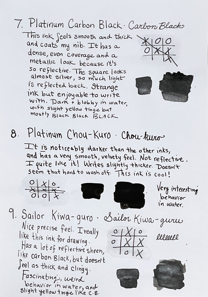 Of the three pigmented inks, I found Platinum Chou Kuro the most enjoyable to write with. I liked all three, but Chou Kuro just felt exceptionally smooth and velvety, and its extreme darkness is quite pretty.
Sailor Kiwa-guro felt the most precise to me of all the inks. I have used it before for fine details in art, and once again I had the feeling that if I were drawing something where I wanted great precision, Kiwa-Guro would be my choice. It produced a slightly narrower line than the other nine inks.
Platinum Carbon Black felt the thickest and glossiest on my nib, although its line width looked about the same as the others. As I discussed before, both Platinum Carbon Black and Sailor Kiwa-Guro have fairly high levels of sheen/reflectiveness, so, if you want a waterproof ink that's very dark, Chou Kuro would be the winner. It's the most matte and absorbs light rather than reflecting it back.
None of the nine inks feathered or bled through the paper, and they all produced a similar looking line, with the slight exception of Sailor Kiwa-Guro, whose line was slightly thinner. They are all excellent inks!
A Little Final Fun
When I was painting with the nine inks, I didn't need to concentrate on words like I usually do while working on my blog, so I decided to listen to music. Naturally, a black-themed playlist was in order! I chose one "black" song for each ink, and used my Platinum Preppy filled with Platinum Chou Kuro ink to write down the list later. If you have a Spotify account, you can listen along.
 I used my favorite shimmering black ink, Colorverse Shiny Black, to write the title with my BB Pilot Custom 74. This ink glistens like crazy, but has never clogged my pen, even though I have kept it filled with the same ink for literally years without cleaning it. (I know, I know. I should regularly clean my pens.)

Look how crazy that shimmer looks when it catches the light! It's like sequins!

I also played around with Chou Kuro a little bit more, and have really been falling for it. There's just something special about using the blackest black ink. No, not everyone needs the blackest black. Just regular black black is fine in most cases! But the Blackest Black is a very intriguing ink, the difference in darkness is not just hype, and this ink is not as scary as some people will lead you to believe.
 Honestly, it's just fun to use. I love the feeling and look of simply scribbling with it. If someone offered me a bottle, I'd leap at the opportunity.
-Laura P.
I love comments on my blog! Please leave comments if you like the articles, and, if you have any questions about this article, or any of the other blog articles, you can e-mail support @ penboutique.com. Thank you!