

Welcome back for another week of pink! I have to admit, the idea of immersing myself in pink would have utterly nauseated me when I was younger. Not only was I a tomboy, it was also extremely important to me to be different. Pink was popular with girls, so naturally I hated it. The color had become so gender-coded in the 20th century that it was hard for me to look past associations with babies, toys for little girls, and young, vapid femininity. Little did I know that, before the 1950s, pink had no specific gender associations, and in fact it was declared a "more decided and stronger color" than blue. Pink was thought of as simply a lighter shade of red, and shared red's associations with vigor and vim.
I wasn't aware at the time, but pink has always made interesting appearances in modern culture that aren't "girly" at all. In 1900, Brooks Brothers introduced their pink button-down shirt for men, which later became a wardrobe staple for those who cultivate an elite, preppy look. For a man, wearing pink shows confidence. In the 1970s, punks embraced the rebellious, "bad taste" style of fluorescent pink, and Paul Simonon, bass guitarist for The Clash, declared, “Pink is the only true rock and roll color." Just think about Elvis Presley in that pink blazer back in the 1950s! He was exhilarating, sexy, and cool. Elvis was influenced by the fashions and music of Black culture, where pink has always had a powerful and exciting role for both men and women. Likewise, in Japanese culture, pink has been fashionable, with no gender divisions, for over a thousand years.
I began to relax my rigidly anti-pink feelings as I matured. Yes, I prefer a more androgynous style, and it's still important to me to be different, but why should an entire color be off-limits? I realized that I actually look really good in some shades of pink, and that I love a pop of hot pink combined with orange, red, purple, white, lime, or black. I treasure my pink and orange Angela Adams rugs, own several pens in various shades of pink, and curl up under a soft mauve-y pink blanket. Subtle and intriguing warm colors like pink grapefruit and coral are favorites of mine, as are metallic frosted roses and rose golds. I also love purple-y pinks that learn toward fuchsia. No, I'm never going to embrace pastel pink, baby pink, or that "Barbie dream house" color I remember from childhood, but so what? I don't like every shade of green, either, but that doesn't mean I write off the entire color and declare that green is not for me. Rather than feeling threatened or ostracized by colors, we can use them in any ways that please our eyes and bring joy to our hearts.
 (Featuring my Vivid Pink Pilot Prera, Petrified Forest Estie with fude nib by nibmeister Kirk Speer, who will be visiting our store November 16th-18th [reserve an appointment on his website!], combo Pink and Orange Caran d' Ache 849 [Leila and I swapped caps!], Faber-Castell Hexo in Rose, and Faber-Castell Grip ballpoint in Pink.]
Picking Favorites
When I decided to write about pink for this article, I looked through our gigantic binder of swatches in the store and wrote down all the pinks that jumped out to me because they seemed special. I ended up with a long list... probably too long. I brought home 33 different pink inks, and was a little overwhelmed by trying to narrow them down to a concise selection of favorites.

After further thought and experimentation, patterns began to emerge, and I crossed out some of the inks either because they were too similar to others that I liked slightly more, or because they didn't really speak to me as much as the others did. I even added an additional one to try. (I'd momentarily forgotten about my customer recommending Pelikan 4001 Brilliant Red, which is actually a pink.)
 I'm not going to claim that I ended up with the definitive list of best or most interesting pink inks. It's merely my list. Hopefully you'll see something that intrigues and inspires you, too. If you have a favorite that I've left off, I'd love to hear about it!
Hot Pinks
I love extremely vivid pinks, and have had a few favorite hot pink inks over the years. Taccia Momo, Anderillium Roseate Spoonbill Pink, Diamine Hope Pink, and Sailor Ink Studio 731 are my top choices in this category. That's #731 in my Royal Tangerine 1911 in the in-progress list photo above. All four inks are very vibrant, very readable, and have bright yellow-gold metallic sheen. Of these colors, Sailor Ink Studio 731 is the darkest, and has the most sheen. Hope Pink and Roseate Spoonbill are very similar cool-toned, energetic shades that are exuberant and optimistic without being saccharine. They have only a tiny hint of sheen. To me, Roseate Spoonbill is slightly sweeter and warmer, and Hope has slightly more shading. Momo falls in between Ink Studio 731 and Hope Pink. It has a moderate amount of sheen and is a touch warmer and darker than Hope, a touch cooler and lighter than 731. It's impossible for me to choose a favorite from these inks.

Deep Pink
My favorite deep pink is Diamine Scarlet. This ink borders on red, but it isn't red. It's a dark pink with a wonderful intensity and nice greenish-gold metallic sheen. I love this color in my cursive nib Lamy Safari. It's perfect when I want a very eye-catching color for emphasis, without the harshness of red. (I'm not a big fan of actual red ink. I always seem to have problems with its flow in my pens. I've had no such problems with Diamine Scarlet.) I love that this color comes close to red but has an underlying pinkness that really adds something special. I've returned to Diamine Scarlet many times when painting with ink because its intensity is hard to match.

Bright Purply-Pinks
My favorite bright purple-pink, for years, has been J. Herbin Rose Cyclamen. Although I own a bunch of different J. Herbin inks, this is the only one I regularly use in my pens because I often find J. Herbin inks too dry and watery for my pens. Not so Rose Cyclamen. I adore Rose Cyclamen, and have refilled the same pen with it over and over for five years. It always writes perfectly, feels smooth and rich, and brings me great joy. It has a little bit of copper sheen, which, for me, gives it the edge over Visconti Souvenir de Mauve, a very similar beautiful color. Rose Cyclamen is one of the most intensely bright inks I use, and it leaps off the page and right into your heart.


Sizzling Pink
Did I just make up these categories? Yes, of course. But Iroshizuku Tsutsuji is the only ink I've found that truly sizzles. This is another extremely saturated pink, of a similar intensity to Rose Cyclamen, but, instead of leaning toward the blue side of the spectrum, it leans toward magenta. Tsutsuji means azalea, and, while azalea bushes come in a lot of different shades, this is indeed the shade I picture when I think about the bright spring flowers. As with most other Iroshizuku inks, Tsutsuji has a smooth, wet flow and is extremely well-behaved. It has lots of bright gold sheen. A similar ink that comes very close to Tsutsuji is Diplomat Orchid.


Dusky Pink
Robert Oster's Dusky Pink stands out as a phenomenal cool-toned pink in a wonderfully mysterious mauve-y wine shade. I love this color, and how different it can look depending on nib size and ink concentration. It's such an interesting and sophisticated color. Kyoto Cherry Blossom of Keage is close, and looked very beautiful in my Tomoe River paper freehand flower experiments, but I found it too dry for me, and hard to write with.


Surprising Pink
I remember how surprised I was when I first swatched Monteverde Kindness back in December, 2020. Diamine didn't do their Inkvent Calendar that year, so I'd decided to create my own homemade Inkvent by ordering samples from various sites and opening one each day in the days leading up to Christmas. Kindness was the last one, on Christmas Day, and it wasn't at all what I expected. I'd assumed it would be a brighter and simpler kind of pink--more like Diamine Hope--but instead it was this extremely interesting and rather sophisticated shade, with very strange and intriguing green sheen. I love that Kindness is actually much more complex than I imagined.


Kindness is somewhat similar to another very beautiful pink, Sailor Sakura-Mori, but Sakura-Mori is more delicate and soft, and doesn't have the surprising elements. Both are wonderful pinks in their own way and I own a full bottle of each.

Warm Pinks
I couldn't choose just one warm pink. Diamine Flamingo Pink was Joy's suggestion, and I agree it's a great one. Did you know that flamingoes get their beautiful color from the brine shrimp and pink algae they eat? I craved this color after I returned from diving in Bonaire for the first time, because one of the best dive locations is near a salt farm with shallow flats that come close to this lovely shade of orangey pink.

I own a bottle of Flamingo Pink, along with Diamine Coral and Sailor Ink Studio 130, and I was pleased when I looked through our Book of Inks in the store and didn't see any I liked better! I also finally got to swatch Pelikan 4001 Brilliant Red, which a customer told me about a few Saturdays ago. You may remember from my Embracing Autumn article:
The Pelikan 4001 Brilliant Red is a wildcard, but this ink was very strongly recommended to me by a customer this past weekend. He told me he is crazy about it, and that he'd bought three bottles at the DC Pen Show, which inspired a whole bunch of other people to also buy bottles after he told them why he loves it so much. He says the color isn't really red at all, but is "a little bit pink, a little bit orange" and has extremely interesting glossy sheen. The way he described it made it sound like the kind of color I'd love, and reminded me of Mercurochrome. I wish I'd written down exactly what he said about this ink, but the store was too busy, so I didn't have time. Regardless... he made it sound so intriguing, I knew I had to try it.
Brilliant Red is actually very similar to Diamine Coral, except it has a lot more sheen and, that guy was right, this is a very cool color! Diamine Coral has a small amount of brilliant gold sheen that showed up only at the edges of my ink drop splotches, while Brilliant Red has the same kind of sheen, but in spades. It's remarkable looking! Both of these inks straddle the line between pink and orange.

I've been using Diamine Coral in my Caran d'Ache 849 to write text that I want to highlight (such as important events in my planner), because it's so vivid and I love the warm color. I enjoy it much more than using a red. The sheen is subtle, but so beautiful.

Sailor Ink Studio 130 is a color I've used a lot for painting, and I love its pretty multi-chromaticism. The yellow and peach elements emerge when I paint with it, and give the art a beautiful glow. It's such a lovely, complex ink that is truly special.

Mysterious Light Pinks
I don't usually like light-colored inks for writing because they are too hard to see, but I know some people really enjoy them, and their shading can be so beautiful. I've included very few unsaturated inks in my favorites list, but I couldn't resist the new Pelikan Edelstein ink of the year, Rose Quartz, and Sailor Ink Studio 237. They are both such fascinating and mysterious colors. I photographed them with my Robert Oster Australian Opal Pink and J. Herbin Bouquet d'Antan (Bouquet of Yesteryear) swatches for comparison. Those are two inks that I love painting with, but don't like in my pens at all. Bouquet d'Antan, especially, is a unique color that looks beautiful in art, and I've used it quite a lot, but I hate how it behaves in my pens. I've seen it recommended many times online, though, so others must like it in the right pen!

Rose Quartz fascinates me because it has weird bluish elements that show up not only in large splotches, but also when I played with the ink on Tomoe River paper. (The ink to the right in this sample is Bouquet d'Antan, and you can see how much trouble I had writing with it because it's so watery! I do love the color, though.)

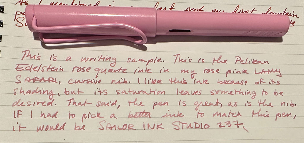
I know my colleague Leila uses Rose Quartz, so I asked her about her experience with it, and, to my surprise, she brought up Ink Studio 237, too. We had each linked the two on our own! Leila tells me she prefers 237 to Rose Quartz because it's a little more saturated. She likes Rose Quartz' shading, and provided me with a writing sample with her Rose Pink Lamy Safari, fitted with a cursive nib. (Thanks for the photo, Leila!)
When I looked at the listing on our website to link Ink Studio 237 just now, I remembered that, back in June 2022, my Pen Boutique team mates Shriya and Winnie were choosing inks to match to each person for one of their TikTok videos, and they chose 237 for me. No wonder I like it! I took a photo of our swatch in the store, at the time. The variation in color on Tomoe River paper is so wonderful.

A week or so later, I chose this ink for one of my ink splats for Instagram.


Metallic Pinks
I have never actually written with metallic pink ink, but I completely love how they look. My two favorites are Robert Oster Rose Gold Antiqua and Rose Gilt Tynte, so if you have a pen that's compatible with this type of ink, go for it! I've used both for art, and love them for that purpose. They are similar, but Rose Gilt Tynte is more bluish, with a mauvey shimmer, and Rose Gold Antiqua is more gold, with a coral-colored shimmer.

I really like both variations and can't choose one over the other!


In a similar vein is the new Sailor Dipton ink, Coral Humming. This ink is for dip pens, not fountain pens, but it's gorgeous. Just as a color unto itself, this may be my favorite ink in the entire article. The warm pale sparkling coral is so incredibly beautiful, I can't stop staring at the swatch I made. It's impossible to capture just how magical it looks as it catches the light, constantly changing and shimmering like gossamer fairy wings.


The Sailor Dipton inks are available either as individual bottles or packaged in a set with a small, lightweight fude dip pen. This pen is fantastic and I highly recommend it! It's what I used for my experiments with these inks, and I couldn't have done this article without it. Every other dip pen I've tried in the past has frustrated me immensely. I've never found one to write reliably, and I've often ended up dipping fountain pens instead, to get better writing samples. Dipping fountain pens produces a good sample, but it takes a lot of time to clean the nib and feed in between each ink, so, if you are testing a large number of inks, this can be extremely tiring and time consuming. The Dipton pen is very easy to clean. All you have to do is rinse it in water. Not only does this pen control ink very well, the fude nib allows you to effortlessly try both thin and thick lines. It's an invaluable tool for testing inks, and the sets, with ink, are only $29!

Three More, Just For Fun
These last three inks aren't really a cohesive category, but I wanted to mention them just because I found them interesting. Colorverse Horsehead Nebula is another shimmer ink, but very different from the three in my last section. This is an ink that was recommended to me by a customer, but I can't remember who it was! It's an extremely cool color and the shimmer is fascinating. I'm not really sure what color the shimmer particles are, because they seem to reflect back all sorts of different colors when they catch the light. I can't capture a good photo of this, but it's very beautiful and cool.

I really, really liked this color when I sampled it, but I couldn't quite get a handle on it. I tried it in one of my pens, but it looked much lighter than it did when I experimented with the dip pen, and I think I should have used a different nib size. I used a broad Sailor 1911S. If you've used this ink, let me know what pen and nib you like best with it!

Another ink I found fascinating was Lamy Crystal Rhodonite. I own other Lamy Crystal inks and love them, especially Azurite, an amazing purple with lots of green metallic sheen, but, when I looked at Rhodonite, I noticed that the bottle has actual crystalline particles in it that shimmer! I had no idea any of the Lamy Crystal inks shimmered. This raspberry shade doesn't turn me on, so I didn't choose it as one of my top favorites, but I find the sparkly crystals very cool. They look more like real rock crystals than normal fountain pen glitter. The orangish sheen is also quite interesting!

I also absolutely had to mention Sailor Ink Studio 831. Again, the raspberry-ish shade of ink doesn't personally appeal to me as much as some of these other colors, but just look at that sheen!


All the Pinks
I don't know how useful these photos are, but here are my ink testing pages. Many of the inks had beautiful features, such as shimmer or sheen, that showed up better in different angles or lighting, so I provided closeups above. However, seeing them together is helpful for comparison purposes, I suppose. Also, you can see the other inks that I picked out to try because I liked their colors, but didn't end up selecting. As I said, the narrowing down process was hard, so just because I didn't choose one, it doesn't mean it's a bad ink! I just liked the ones I picked better, and my opinion is pretty subjective. You may see one that calls out to you!


I actually liked all the Sailor Ink Studio pinks I tried, by the way--130, 131, 231, 237, 431, 731, and 831. They are all such cool and complex colors.
Okay, that's it for me and pink inks! Pink is a color that can serve us in many different ways, whether it be to express a soft and romantic side, to capture a mysterious sophistication, or to scream, "Look at me! I'm different!" I had a lot of fun exploring these colors, and apologize for not providing more writing samples, but I only have so long to write these articles, and testing and photographing inks can be quite time consuming. I think I proved, to myself at least, that pink is a complex and surprising color with many facets to it. Again, please comment below if you have a favorite that I didn't mention. I'd love to try it. I also think it would be interesting to write an article about inks (of any color) recommended by readers, so it would be very helpful to me if you have suggestions. If you write to me, please let me know why you love the ink and how you use it. You can send your favorite inks to laura.p@penboutique.com.
-Laura P.
I love comments on my blog! Please leave comments if you like the articles, and, if you have any questions about this article, or any of the other blog articles, you can e-mail support@penboutique.com. Thank you!