What is Blue-Black?
The idea for this article popped into my head a few weeks ago, and I couldn't shake it. Blue-Black. It didn't sound very exciting at first, but, the more I thought about it, the more obsessed I got. I very rarely write with blue-black inks, and I don't have a favorite, but it's such a classic, readable, and useful ink color, and one that has a fascinating history, as well. Blue-black has a seriousness and an elusive elegance that's hard to pin down. It's not black, but it's not blue, either. There's something very intriguing and mysterious about it. It's the color of a midnight sky, the ocean at night, ink cap mushrooms, magpie feathers, and Echinothrix diadema (one of my favorite kinds of sea urchin). Blue-black ink can have beautiful sheen, and it can be amazingly impervious to water. It has especially beautiful depths, subtle nuances, and a surprising amount of variation. It's also the perfect color to use in a business setting when you want something in between black and blue, especially when you need a color to stand out from black when writing on copies, without looking too light, as blue sometimes can.

[Sheening blue-black inks in bright sunlight: Visconti The Starry Night, Pelikan 4001 Blue-Black, Iroshizuku Shin-kai, Sailor Shikiori Yonaga, and Taccia Koiai.]
In the world of inks, Blue-Black began as an iron gall ink with blue dye added, which allowed writers to clearly read what they wrote as they were writing it. As the iron gall darkened with exposure to air, the color would change from bright blue to black. Blue-black morphs. It doesn't want to be pinned down. It's controversial. Many of the inks widely categorized in the fountain pen community as blue-black actually lean quite far into blue territory. If you ask me for a blue-black Waterman ink, I will hand you Mysterious Blue. Is it really blue-black? No, and it doesn't claim to be. It's dark blue. But it's the darkest blue that Waterman makes, and it is often included on lists of favorite blue-black inks. What about Iroshizuku Shin-Kai and Iroshizuku Tsuki-yo from Pilot? They are both often named as blue-black favorites, but are both inks actually blue-black? Maybe not. Are they both beautiful? Unquestionably.


[Tsuki-yo and Shin-kai pictured with Pilot Custom Heritage SE fountain pen in Marble Blue.]
As with blue-green, red-orange, or blue-violet, blue-black is a compound adjective, and the first word describes the second, so blue-black is a bluish shade of black. Black-blue would be a blackish blue color. A true blue-black is a deep black color with a cool-toned bluish tinge. In paints, it's made from bone black and Prussian Blue. It shouldn't have any red or warm undertones. Does reddish sheen count? I don't think so, but some people do. My friend Bill thinks Visconti's The Starry Night has too many "extra colors" in it to be considered a blue-black. I think it's an especially rich deep blue-black with incredible copper sheen.


[Pictured: Visconti Van Gogh The Starry Night fountain pen and ink.]
In the world of inks, there are many inks named Blue-Black, Blue Black, or Blue/Black that lean much more blue than black. Pelikan, Monteverde, Lamy, Colorverse, Diamine, Aurora, Sheaffer, TWSBI, Platinum, Sailor, and Pilot all make their own version of blue-black, and some are more blue-black than others. There are also many inks that fit the category but feature more poetic names, like Midnight, Deep Sea, Long Night, Moonlight, Raven, Thunderstorm, and Magpie.

[Pictured: Aurora Blue/Black with limited edition Montegrappa Elmo 01 fountain pen in Stonewash Blue.]
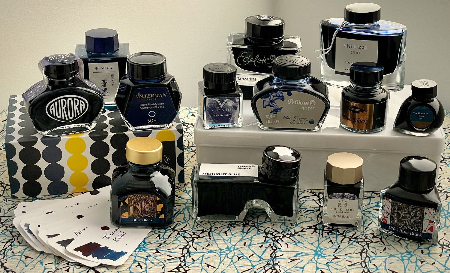
For this article, I decided to include classic inks that are mentioned in discussions about favorite blue-blacks, whether or not they are technically blue-black. I also wanted to include some new discoveries of mine that you may not be familiar with. And I even included a few outliers that may or may not be blue-black. That's up to you to decide. Or not. It's my feeling that we don't need to be sticklers about blue-black. Blue-black can mean a lot of things to a lot of people. Maybe you'll discover a new favorite ink in this article that's merely blue-black adjacent. And that's okay.

Here are some of my favorites side by side on hot press watercolor paper. I used a paintbrush for the swatches, and my Sailor Hocoro fude dip pen for the writing. The colors vary a great deal with angle (showing more or less sheen) and lighting, but this photo gives you a pretty good idea how they compare. I feel like Iroshizuku Tsuki-yo is an outlier--it leans more toward a very deep peacock blue--but it's the most beautiful. Diamine Blue-Black also stands out to me as especially rich and beautiful, and I find it fascinating. My eyes are drawn to it and get lost in it. I also think Sailor Shikiori Yonaga is special, as is Sailor Shikiori Kasasagi (Magpies), although I feel Kasasagi/Magpies is more of a very very dark teal with complex and elusive sheen. But, it's such a cool ink, I had to include it anyway. I think the most "real" blue-blacks (i.e., more black leaning, with a blue tint) are Aurora Blue/Black, Diamine Archival Registrar's Blue Black, and Diamine 1864 Blue Black. Pelikan 4001 Blue-Black is, to me, the most harmoniously balanced: just the right amount of blue, just the right amount of black.
Pelikan Blue-Black
The genesis of this whole article actually started with Pelikan 4001 Blue-Black, and I blame Chartpak National Sales Director and Pelikan Brand Manager Gary Lange. Although he's a very busy man, Gary acts as Pen Boutique's Pelikan representative along with all his other responsibilities. He claims this is because we need so much extra attention, but I'm pretty sure it's just because he likes us. I'll never forget the excitement with which Gary talked about Pelikan 4001 Blue-Black ink the first time he came to our store for an event, back in early December, 2023. I had no idea there was anything special about Pelikan Blue-Black, and I'd never thought of blue-black ink as an especially interesting color, but Gary told me it's his favorite ink, and that he was thrilled to have it back in the US because it had been discontinued in North America for over ten years. That definitely piqued my interest. What was the controversy with 4001 Blue-Black?!

Gary explained to me that the ink's unavailability had actually been caused by a huge misunderstanding! Someone had believed there was an ingredient in 4001 Blue-Black that didn't comply with the United States Toxic Substances Control Act (TSCA), making its importation and distribution illegal here. For a while, Pelikan ink fanatics hoarded it and "smuggled" it in from Europe to get their fix, or just suffered without their beloved Blue-Black.

In the meantime, people kept asking Gary why they couldn't get Blue-Black in the US, and he got very curious. Although he loves Pelikan Edelstein Tanzanite, too, and I've seen him using it in his pens, 4001 Blue-Black is a little bluer, and Tanzanite is a little greyer. Like many of us, Gary got fixated on an ink color. "I guess I could have just left well enough alone and continued on my merry way with Tanzanite," Gary admitted to me when I asked him to tell me more about this story later. "But no."

"I began by working with the chemists in Chartpak’s lab, who assured me there is nothing in the ink which would prevent us from bringing it into the US. I then went to Pelikan's chemists, to find out if there was anything they knew that prevented our distribution. They assured me there was no reason." Crazy! Gary added, "The interesting part of this whole thing is that the European Union's chemical regulation law, REACH (Registration, Evaluation, Authorization, and Restriction of Chemicals), is considered to be significantly stronger than the US Toxic Substances Control Act (TSCA), meaning that REACH imposes stricter requirements. It always seemed odd to me that the ink would be safe for Europe, but not safe for the US, considering the ink was okay with REACH."
So, Gary brought it back, with no changes to the formula, blasting the news "Blue-Black is Back" in a full page ad that he created for Pen World magazine. (You can see a picture of the ad in the excellent article about 4001 Blue-Black on The Pelikan's Perch website!) We actually didn't have Pelikan 4001 Blue-Black yet at Pen Boutique during that event with Gary, so I had never tried it, but hearing him talk about how much he loves it made me group it with other inks that seem special in my mind, and when I saw Pelikan Blue-Black ink listed in the "coming soon" section of our website several months later, I got very excited.
When I walked into the store one morning and finally saw Pelikan Blue-Black waiting on the counter, I was giddy! Yes, it was just a seemingly ordinary Blue-Black color, but, after that big buildup, the mystique of Pelikan Blue-Black was very real to me. I couldn't wait to try it. I wasn't disappointed. It's a very handsome color, flows perfectly in my wet Pelikans, and dries quickly on the page. It even has a little bit of subtle sheen!

[Photo with vintage Blue-Black bottles and pens from his collection courtesy of Eric Arnold. Pens featured are his M805 Blue Dunes, M400 Black/Blue, and vintage Classic M150. Thank you, Eric!]
As for Pelikan Edelstein Tanzanite, this ink is also a pleasure to use. I didn't include it in my ink swatch grid, because it is, like Gary said, a little more greyish on most paper, and I only had space for sixteen colors. It was very hard to narrow my choices down to sixteen, but I decided to leave out Tanzanite and just compare the two Pelikan colors separately. When experimenting with Tanzanite, I found it fascinating that it definitely looks more grey on my Col-o-ring swatch cards and on Clairefontaine paper, but is a slightly teal-leaning blue-black on Tomoe River paper, where it is similar to Colorverse House of Twain, but with a greater abundance of copper sheen. It is a little less dry than 4001 Blue-Black, but both colors are formulated to work great with wet-writing Pelikan pens.

I was obsessed with Edelstein Tanzanite back in April, but all stores in the US were sold out. After scouring the Internet and only finding bottles priced sky-high on eBay, I was lucky enough to find one remaining on the shelf at Pen Boutique that had been accidentally left out of inventory, so I immediately snagged it and bought it. At the time, Gary told me that the reason Tanzanite was impossible to find was that there was a shortage of Edelstein bottles in Germany because the newest limited edition Edelstein color, Golden Lapis, had used them all up. This week, I talked to him about it again, and there is great news! Gary says, "Tanzanite is back up and running in production and expected to be available soon. In addition to the glass bottle issue, there had been a raw material for Tanzanite that had been unavailable for many months and is now back." Hooray! Tanzanite lovers can rejoice!
Permanence
I had never really thought much about Blue-Black as a color before Gary's Pelikan 4001 Blue-Black story ignited my imagination, but Blue-Black actually has a unique and fascinating place in the ink world. Before fountain pens were invented, the standard ink formulations in Europe between the 5th and 19th centuries were iron gall inks made with iron sulfate and tannic acids from sources like oak galls. They were often homemade, and most would write with a light grey or blue color that darkens to deep blue-black when exposed to air, due to the oxidation of the iron ions.
Iron gall inks were still widely used during the early days of fountain pens, and were common until the latter half of the 20th century, when chemically-produced inks took over. They are still sold today, but aren't as popular as dye-based inks. Iron-gall inks are acidic and can be corrosive if left in a pen for a long time, but modern fountain pen friendly formulas are safe to use in most modern pens. As the ink develops its distinctive blue-black hue, it also becomes resistant to light and dampness, so fountain pen users sometimes choose iron gall inks when permanence is especially desirable.
In the U.K, special blue-black archival quality Registrars' Ink containing ferro-gallic compounds is required for certain official documents like marriage certificates, birth certificates, death certificates, and ships' logbooks. Diamine makes an iron gall Archival Registrar's ink that is water resistant and archival in quality, and I tested it when I wrote my article on Water Resistant Inks back in the summer of 2022.

This ink is extremely water resistant and passed my tests with flying colors! It smells a little weird, but I actually enjoy the Chloroseptic throat spray-like scent, and I was very impressed when I soaked my writing sample in water and found that the ink didn't budge. The writing looked identical before and after its dousing. I also find it fascinating and beautiful to watch the ink darken as it dries. I really like this ink, and enjoyed trying it again for this article.

Of course, most blue-black inks made for fountain pens these days are not iron gall inks. Pelikan 4001 Blue-Black does contain a small amount of iron gall and is more water and light resistant than other inks from the 4001 line. (There has been much discussion in online forums as to whether or not modern 4001 Blue-Black contains any iron gall, but I have this information straight from Gary. The formula has not changed, and it does indeed contain some.) The amount of iron gall in it is very safe, and it won't cause corrosion to your pen's feed or harm the paper. It's a well-behaved, low maintenance ink that can safely be used even in older pens. But, like other ink containing iron gall, Pelikan's Blue-Black does shift to a more greyish tone over time. Likewise, when it gets wet, the blue part of the ink will wash away, but the color left behind will still be legible.
I decided to try out just how water-resistant Pelikan 4001 Blue-Black is, and was impressed by the results! I compared it with the iron-gall Diamine Registrar's ink and nano-pigmented Souboku ink from Sailor, both of which I'd also experimented with in my article on water-resistant inks.

I've used the slightly bluer nano-pigmented Seiboku quite a bit, and would name it as a favorite ink, so I knew Souboku would perform well. I discussed all the Sailor nano-pigmented inks extensively in my "Fun with Water Resistant Inks" article, and I recommend them often in the store. These inks have minuscule particles of pigment suspended in the ink formula, and are therefore more permanent than the water- and dye- based inks we most often use in our fountain pens, because these solid particles adhere to the paper and bond to the fibers over time. As with iron gall inks, they can be slightly more difficult to flush out of your pen, but I think they are completely worth it.
I also included Pelikan Edelstein Tanzanite to further compare it with Pelikan 4001 Blue-Black, and, just for the heck of it, threw in Sailor Shikiori Kasasagi because I am fascinated by it. (More on that later in this article!)


After allowing them to fully dry and bond with the paper, I soaked the sheet of Clairefontaine Triomphe in water that was dripping from my roof as our recent snowstorm melted. As I expected, the Diamine Registrar's ink and Sailor Souboku both looked identical before and after being doused! After the paper dried, Sailor Souboku's sheen even returned intact. The blue dye from the Pelikan 4001 ink washed away in the water, and its color lightened as a result, but the core of the ink remained sharp. The Tanzanite did not fare as well, and washed away quite a bit, although it was still legible (many dye-based fountain pen inks would not be!). I was most surprised by the Sailor Kasasagi. I'd assumed it would wash away most, but, on the contrary, it remained very dark. However, the ink had not bonded with the paper like the iron-gall and pigmented inks, so color from Kasasagi muddied the water and left the writing dirty looking. Overall, I was pretty impressed by all these inks, however!
Sailor Magpie and Long Night
I originally decided to include Sailor Kasasagi in this article after reading a fascinating review of it at the Well-Appointed Desk blog. I knew going in that it is a little more green-leaning than a classic blue-black, but it's such a dark color that it effectively functions as a blue-black with extra complexity. As described in the review, "In writing, it looks dark gray or black until suddenly… it doesn’t. Suddenly you stop and admire that there is… something… different about the ink." Sailor writes that this ink is "a delicate blue-green that glints like the fabled feathers of the magpies of the milky way" in the famous The Cowherd and the Weaver Girl fairy tale that appears in many forms throughout Asian folklore and literature.
I love this ink, and I've been writing with it in my new Montegrappa. It's a very rich, smooth, dark ink with beautiful luminosity. I photographed my swatch during a few minutes of quiet during a busy Thursday when I needed to cover the store for a coworker who was out sick. The color looks amazing with the urushi lacquer Sailor King of Pens 'Kaga'.

[Featured: Sailor King of Pens Urushi 'Kaga' Slate Blue (Bespoke Dealer Exclusive) fountain pen and Sailor Shikiori Kasasagi ink on Yak Leather Crazy Horse 24 Pen Zipped pen case.]
I also especially love the beauty of Sailor Shikiori Yonaga, which means "Long Night" in English. I "splatted" this ink in the store way back in March, 2022, and wrote at the time, "Sailor Shikiori Yonaga is a rich deep dark blue with some amazing sheen on Tomoe River paper! It sheens both purple AND bright metallic green! I used this ink in my blog this week, and it also contains pretty turquoises and pinks if you get it wet (like if you are using it for watercolor style painting). Gorgeous ink!"


[Featured: Sailor Professional Gear Slim Shikiori Sansui Yuu-tsubame fountain pen and Sailor Shikiori Yonaga ink.]
Even standard Sailor Blue Black is nice, but not as vibrant looking as the Shikiori or Iroshizuku inks. It's a very slightly teal-leaning blue-black, and can sheen a coppery red, but has more of a dullness to its appearance. Not bad for such an affordable and well-behaved ink, though!

[Featured: Sailor 1911L Ringless Galaxy Pleiades fountain pen and Sailor Blue Black ink.]
Pilot Deep Sea and Moonlight
Sailor makes amazing blue-black inks, but what about Pilot? I knew right away that I would include both Iroshizuku Shin-kai and Tsuki-yo in this article, but I was surprised to see regular Pilot Blue Black mentioned over and over again when people discussed their favorite blue-black inks online. Pilot Blue Black isn't available in bottles in the US, so I made the decision not to include it when I created my ink swatch grid, but, as I worked on this article, I couldn't stop wondering about it. Even though I had already spent too much time working on this, I just couldn't let it go, and, at the last minute, I decided to test a Pilot Blue-Black cartridge in a medium nib Vanishing Point on Friday. I was very impressed by the superb flow, nice color, and excellent shading! Pilot Blue Black even has a little reddish sheen.

[Featured: Pilot Vanishing Point LS in blue, Pilot Blue Black cartridges, and Leuchtturm 1917 notebook in Fox Red, with my own postcards.]
Here's how the color compares to the two other inks often named as Pilot's blue-blacks. I would say Pilot Blue Black leans a little more toward royal blue than either of the Iroshizuku inks, and the color is a little more simple, but it's very nice.

Speaking of Pilot's Iroshizuku inks, there is much online debate over Shin-kai vs. Tsuki-yo, and, surprisingly, I have seen both inks declared Iroshizuku's "true" blue-black color, with the other being dismissed as not blue-black enough! I recently posted a "face-off" video on Instagram to try to elicit opinions on the two inks, and the general consensus was that both inks are beautiful. Commenters' favorites were split equally between the two inks, but many said they love both, and several told me they both count as blue-black.
Both inks are an absolute pleasure to write with, wet, and well-behaved. Shin-kai means "Deep Sea," and our Pilot rep, Bill, told me he considers it Iroshizuku's blue-black because it's a darker ink that fits his traditional image of blue-black. When I showed him all my blue-black swatches, he ranked it as one of his top three finalists in the category of truest blue-black ink.


[Tsuki-yo looks amazing with the marbled blue Pilot Custom Heritage SE! Like Tsuki-yo, this pen has a radiant depth and a slightly petrol lean.]
Before I move on from Pilot, I decided to test regular Pilot Blue Black at the last minute to see how water resistant it is. I had already completed my other permanence experiments, but saw multiple mentions online about Pilot Blue Black being surprisingly waterproof. Again, although I was essentially finished with this article already, I couldn't resist adding a little more information before publishing!
Well, now I see why Pilot Blue Black has so many fans! Not only does it have nice sheen and shading, a very attractive price, and behave perfectly in your Pilot and Namiki pens, it is definitely very water resistant! You can watch a video of my experiment on Instagram, and here are the before and after photos. Wow!


A small amount of ink washed away, but, in the end, my drawing and writing were extremely sharp, quite readable, and not clouded by murky ink residue! I used my extra-fine Pilot E95s to do the sample, so these are very thin and precise lines. Very nice, Pilot!
Diamine Depths
Obviously, it was impossible for me to write or experiment extensively with every ink I selected (I'm not superhuman!), but when I had to choose a pen and ink to bring with me to the Philly Pen Show last weekend, I went with Diamine Blue Black in one of my Pilots. I had never used this ink before, but it stood out to me in my swatches, and I wanted to try it.

Maybe that swatch just turned out especially nice, but my eyes keep returning to it when I look at my grid of colors. To me, it has such an intriguing and lovely range of shades. I get lost in it. I admit it's more on the blue side of blue-black, but, as colors go, this is my favorite in the lineup, at least in swatch form. The coppery sheen present in many of the other blue-blacks seems especially nice with this intense blue that leans a little warmer than most of the others but doesn't verge on peacock, teal, or petrol. It looks luminous and rich, and I love how it moves between dark nearly-black intensity and Waterman Blue-esque luminosity. It reminds me of the night sky.
The ink has behaved flawlessly in my pen. It doesn't have noticeable sheen in writing, but it does have a little bit of subtle shading, which makes the writing look dynamic. It's a very professional-looking, dark color, but not boring. Below, I paired both inks with a Diplomat Aero in glossy Midnight Blue. I love this recent addition to the Aero lineup!

Diamine 1864 Blue Black is very nice as well, and is more of a true blue-black color. It leans more to the black side of blue-black and looks like a mysterious midnight sky as opposed to standard Diamine Blue Black's magical dusk.
Here's Diamine 1864 Blue Blue Black above, and Diamine Blue Black below:

Taccia and Twain
When I was working on this article, a customer named Andrew came into the store and was disappointed that we were temporarily sold out of Taccia Koiai. I agreed: it was one of the inks I had most wanted to include, and I used a small sample vial of it that I had at home to do my swatches, because I feel like it is an essential and special blue-black. I haven't used it in my pens very much, but Andrew has, and he started rhapsodizing about it.
He told me that it was his favorite ink of the year last year, and commented, "through normal writing, it is really dynamic." It shows "a lot of red sheen, but plenty of different colors underneath." He says he "can see blue-black, blue, and black all separately" when writing with it. He added that it's "business enough, but a little bit fun, too." What a great endorsement!
Not only is this ink very vibrant, with its sizzling sheen, but it's part of Taccia's Ukiyo-e series, which come in 40 ml bottles inside beautiful boxes covered with images from artists who were masters of Ukiyo-e, a traditional Japanese style of painting established in the Edo-period (17th century). This art featured the lifestyle, trends, and play of the people of the time. The term ukiyo-e (浮世絵) translates as "picture[s] of the floating world." Taccia describes the colors used for Ukiyo-e as "too delicate to be expressed in a single word," and their Ukiyo-e inks endeavor to reproduce these elusive colors.
Koiai is inspired by artwork by Japanese artist Hokusai, who drew 36 kinds of landscape paintings with Mt. Fuji included as a part of the scenery. I paired the ink with my Pilot Custom 743 for this photo.


[Featured: TWSBI Vac700R fountain pen in Special Edition Kyanite Blue and and Colorverse USA Special House of Twain ink.]
When I started this article, I asked Gary from Pelikan, "Why do you love Blue-Black so much? What's so great about it?" He replied, "This is a fun question for me. First of all, I have used black ink in my pens nearly my whole life. Anyone who knows me knows I love black. I cannot go shopping for a new shirt and see 14 different colors without immediately choosing the black one. But when I work, I like writing notes in blue to stand out from the black text to see my notes more clearly. But I always feel regular blue inks are too light and too far away from black. So blue-black is for me! Best of both worlds." What a cool answer. Now I get it. Blue-black is far from boring, and I haven't been this obsessed by a topic in quite a while. I don't know what it is about blue-black, but I just can't stop thinking about it, experimenting with it, and even dreaming about it. I'm sad that this article is over, because, even though it is very long, I want to keep writing more! If you'd told me this would happen when I first decided to choose this topic, I would have laughed. But there's just something about blue-black.
-Laura P.
I love comments on my blog! Please leave comments if you like the articles, and, if you have any questions about this article, or any of the other blog articles, you can e-mail support@penboutique.com. Thank you!

[Pictured: Montblanc Starwalker Space Blue Resin fountain pen and Montblanc Midnight Blue ink. Read more about this pen in my blog article on it. It's one of my favorites from Montblanc!]

12 comments
Stacy
This article is taking me back to my exploration of dyes. I’ve spent only a bit of time with an indigo vat, but let me say that, if you find blue-black inks intriguing, you’d also love seeing the depth of color from an indigo bath. Maybe you’ll even find the green sheen.
I don’t use blue-black ink very often; so, my vintage bottle of Scheaffer Skrip Permanent Blue Black is long lasting.
Eric Arnold
I have long been hoping you would tackle this topic, I very much live in a blue-black world, having spent years patrolling beneath the blue in a black submarine. The first bottle of ink I bought was Pelikan Blau -Schwarz, and I used it exclusively in my fountain pens for a very long time. This space has so much depth and variation, and it speaks to my soul. This particular article was truly a gift!
First impressions:
After deep and careful consideration, I have concluded that Gary’s shirt was dyed with Pelikan 4001 Blue-black. But I am not 100% certain. I have a niggling feeling he may have actually dyed it with Iroshizuku Shin Kai, and that the monitor color representations are a bit off. I wouldn’t put it past him. Very crafty of him to wear that shirt and bring up the topic!
I’d like to second Ben Kemper’s recommendation: you should definitely consider free-lancing for Pen World or other appropriate venues. Your writing on these topics is unsurpassed. Whenever I see the email that your latest blog has been posted, it is as if I see you grinning, looking over your shoulder and beckoning me into a secret world. Even if it is a place I thought I knew a lot about, when I take your hand and walk into it with you, you show me new things. Your curiosity leads you to pull back the veil and reveal what is special about anything that you write about, and your overflowing passion for it is just a delight. Thanks you for sharing that gift; it enriches all of us!
I currently have my Estie Raven inked with Diamine’s Blue Black, it is what I use for my journal. I have another Estie inked with Diamine’s Stormy Seas, which you did not mention but i feel may also fit in this category. Pelikan Blau-Schwarz is also still a staple in my collection. Not sure how I did not know about Shin Kai, but I will certainly ink my next pen with it. I feel like Waterman’s Mysterious Blue is living right on the edge here, but again, an ink I somehow did not have, and next time I re-ink my Carene (currently sporting their Florida Blue), that will be my choice.
How fortunate we are to have such a fine array of blue black inks to choose from, and to have such a knowledgeable guide with which to explore that world. If I were to offer one complaint about your article, it is that it ended! I wonder if you will now consider bookending this with an article on blue inks and an article on black inks. I’d buy and re-re-read that trilogy in a heartbeat!
Michael C
Hi Laura,
I really enjoyed your incredibly comprehensive blog on probably my favorite subject. Blue-Black has always been my go-to ink color, since the mid-1980s when I got my first fountain pen (Shaeffer Targa….still have it!), followed by my first higher-end pen (Waterman Le Mans 200…a beautifully designed instrument). I was in high school and I remember asking my mother what color I should get, since she was a Beverly Hills secretary (her name for the job, not mine) in the early 1960s. She told me her boss, who was a very wealthy, art-loving industrialist, always used blue-black for all the reasons you and Gary mention. Since then, I’ve been a fan.
I have over 75 bottles of ink, and at least half of them are blue-black or blue-black leaning. It’s hard to pin down a favorite, but the ones I keep using over and over are: Pilot, Platinum, Shaeffer (a lovely, underrated color), Aurora, Taccia Koiai (which is sumptuous) and of course, Pelikan, which has always been one of my favorites for its strange muted indeterminate grey-leaning tones. I’ve become a recent fan of Akkerman’s Koniginne Nachblauw, which is great for blue-grey aficionados.
I’m a recent fan of the Monteverde blue-black because the blue is so hard to perceive; I like it when it takes a little work to figure out what it is. I also like that it is somewhat water-resistant and good for addressing envelopes, though my recent fave in that category is Sailor Souboku.
I never tire of Iroshizuku Shin-Kai and Tsuki-Yo but their lack of water-resistance causes me to use them very intentionally (I tend to spill water and coffee at my desk!).
I still get nostalgic with Shaeffer and Pelikan—they are so reliable and solid—and I dare say, a little weird.
I appreciate how all-encompassing and well-researched your blog is—thank you!
—Michael
William Robertson
This essay is interesting, informative, and a delight to read. I am among those for whom the quest for one more interesting blue-black never ends. Your pictures and comments gave me some new ideas. I share your affection for Shin-kai, and if I could only use one ink from now on, that might be it. The one ink that as I was reading I said, ooh, try this one, is Bungubox 4B. An attractive and very user-friendly ink. If you mentioned it and I missed it, I’m sorry.
This essay is interesting, informative, and a delight to read. I am among those for whom the quest for one more interesting blue-black never ends. Your pictures and comments gave me some new ideas. I share your affection for Shin-kai, and if I could only use one ink from now on, that might be it. The one ink that as I was reading I said, ooh, try this one, is Bungubox 4B. An attractive and very user-friendly ink. If you mentioned it and I missed it, I’m sorry.
John Michener
I use a homebrew blue black: 8:1 mix of Noodler’s x-feather blue and x-feather black. The result is a dark permanent bluish black that looks all but black in a XF nib (pilot posting nib) and is a dark blackish blue in medium line widts. For wider line widths I use Platnium carbon.
I use a homebrew blue black: 8:1 mix of Noodler’s x-feather blue and x-feather black. The result is a dark permanent bluish black that looks all but black in a XF nib (pilot posting nib) and is a dark blackish blue in medium line widts. For wider line widths I use Platnium carbon.
Fritz Levy
I must confess that I never thought an article on blue-black inks would be interesting. (Sleep calls!) But I found this one fascinating, and I thank you for it.
p.s. I’ve usedDiamine blue-black for years. Shin-kai also works.
I must confess that I never thought an article on blue-black inks would be interesting. (Sleep calls!) But I found this one fascinating, and I thank you for it.
p.s. I’ve usedDiamine blue-black for years. Shin-kai also works.
Ben Kemper
Excellent article Laura. I’m a big fan of Aurora Blue-Black and Waterman Mysterious Blue. Please consider freelancing to Pen World or other appropriate publication. You have such a strong voice and research your articles so thoroughly. I think it would attract customers to Pen Boutique, so it’s the best of both worlds.
Excellent article Laura. I’m a big fan of Aurora Blue-Black and Waterman Mysterious Blue. Please consider freelancing to Pen World or other appropriate publication. You have such a strong voice and research your articles so thoroughly. I think it would attract customers to Pen Boutique, so it’s the best of both worlds.
Jacob Moyer
Colorverse Blue-Black is my new favorite!
Colorverse Blue-Black is my new favorite!
Dan Workman
Ferris Wheel Press’s “Stroke of Midnight” has a beautiful blue/black base with a gorgeous shimmer to boot!
Ferris Wheel Press’s “Stroke of Midnight” has a beautiful blue/black base with a gorgeous shimmer to boot!
Daniel
I find it amusing that you’ve just come out with this article as I’ve really been thinking about blue-black ink this past month.
I recently bought a Cross Bailey (from you!) and I picked up a pack of cartridges for it that happened to be blue-black ink. I wasn’t sure I’d like it because, like Gary from Pelikan, I’m almost exclusively a black ink sort of guy. But it’s now become my favorite color! It makes black exciting. It gives blue some depth.
Geoff Braden
Dear Laura,
I think your article about Blue-black inks is spot on. I have written with fountain pens for 50 years and far and away my favorite color of ink is blue-black. I have probably used more Parker blue-black than any other color. I am currently writing with a Parker 45 that I bought for myself when I graduated from college in 1972. I am using a combination of cartridges and a bottle of Parker Blue-black ink. I think the Parker blue black is similar to the Pelican blue-black. I also use diamine inks in Red Dragon and Oxblood colors. When they dry, they look like dried blood (a little weird-I know), but I am a gastroenterologist. I also like the Conklin Deep blue ink. I probably own 2,000 fountain pens including some limited editions-kind of crazy!!!. We are moving from Utah to Rehoboth Beach, Delaware in a few months and I plan to visit the store in Columbia, Md. Thank you. Geoff Braden. My regular e-mail address is gastrodoc@comcast.net. Keep up the good work.
Matt Alley
Hi Laura; enjoyed your musings on Blue Black! I would add one common B-B you didn’t mention, the one I first encountered in my fountain pen journey back in the early-90s: Parker Quink Blue Black. I prefer Quink Blue, but Blue Black is a true bluish black, not a dark blue.
Cheers!
Hi Laura; enjoyed your musings on Blue Black! I would add one common B-B you didn’t mention, the one I first encountered in my fountain pen journey back in the early-90s: Parker Quink Blue Black. I prefer Quink Blue, but Blue Black is a true bluish black, not a dark blue.
Cheers!