Sometimes it takes me a long time to get around to the things on my "to-do" list. This past July, I made a reminder to myself to write a blog article comparing Pilot's two flexible FA (Falcon) nibs: the #10 size available on the Custom Heritage 912 and the #15 size that you can get on the Custom 743. You might assume (as I did at first) that the two FA nibs are the same, but a customer who did a lot of research before making her purchase tipped me off to the fact that there is actually a noticeable difference between the two. Pilot's flexible specialty nibs have excited me for a long time, so I was very eager to experiment with the nibs myself and study more about them. But, I got busy with other things, and had to put my article idea on the back burner.
Since I've been on a bit of a Pilot kick lately, and am seriously thinking about getting a new Pilot pen for myself, I decided to finally take home the two pens and really get into it, trying both nibs, along with all four nib sizes available on Pilot's Falcon/Elabo fountain pen, which features a different uniquely shaped soft nib. Each one allows you an individual experience, and the distinction between these pens and nibs can be confusing, but, after a week of research and experimentation, I'm ready to share what I've found! Using the flexible nibs is a lot of fun, and really brings a special je ne sais quoi to your writing, so, if you're curious about how to use them and how to choose the best one for you, read on.

(Pictured, clockwise from top: Custom 743 with FA nib, Falcon in resin, Falcon 2 in metal, and Custom Heritage 912 with FA nib. I chose all black pens for the photo, but more colors are available!)
Flexible Nibs
A nib's potential for giving flair to my writing with line width variation has intrigued me since my very first interest in fountain pens. My pen pal at the time was a retired doctor in his 80s, who had grown up with fountain pens, collected them, and used them regularly. His pens were all vintage ones, and I loved seeing his expressive writing when I eagerly opened each letter to read his insights on opera singers, painting, gardening, science and nature, human issues, and his interesting life story. Inspired by my mentor's eloquence and verve, I bought my first fountain pen, a Pilot Metropolitan, because I wanted to experience its effect on my writing. The variation that came from using a simple Metropolitan was minimal, and mostly achieved through the natural shading that occurs when ink pools more heavily where your nib rests longer on a page, but the look and feel of the fountain pen writing experience was irresistible and exhilarating. Already my handwriting looked much more expressive and my thoughts flowed more freely and expansively.
I still wanted to get a taste of that distinctive look I saw in Will's letters, so, after a little research, I learned that most modern flexible nibs can't compare with vintage ones, but Pilot's "soft" nibs are a good place to start. Unlike stub nibs, which feature a blunt, squared-off tip that produces broad vertical strokes and thin horizontal ones, nibs like Pilot's soft specialty nibs produce variable line width based on the pressure you apply while writing. Pilot doesn't call any of their nibs "flex nibs," as there is meaning to this term that implies a much more dramatic amount of bending than their nibs are designed to accommodate (that doesn't stop other brands from using the term, rightly or wrongly), but their Soft Fine, Soft Fine Medium, Soft Medium, Soft Broad, and Falcon (FA) nibs are pliable enough to allow for a gentle version of the beautiful and distinctive look I was hoping for. Pilot's Falcon/Elabo is the least expensive and easiest to use, so it was my next pen purchase, and, for me, it was the perfect gateway into the world of flex.
We do carry a number of pens with steel "flex" nibs, and those are fun to play with if you want a much more subtle effect and lower price point, but, because gold is a much softer metal than stiff steel, I've found the smoothest, most dramatic, and most satisfying experience when I've used sensitive and responsive gold nibs designed to allow their tines to bend gently and spread slightly to create lines whose widths become thicker on your downstroke and thin again as your pen's pressure decreases as your stroke sweeps upward and across the page. A flexible nib's line variation has a very organic look and feel, and is reflective of your particular writing style, mood, and rhythm. 
It can take a little while to get used to the feeling, and it's important to practice with your new pen while you become familiar with how it responds to the pressure you apply, the speed you write, and the shapes you are creating with it. A flexible nib won't magically give you the ability to write beautifully and develop calligraphy skills, but it does add an expressive look to your writing and can feel inspiring and freeing.

Before you start using a pen with a flexible nib, be sure to gently clean the nib with room temperature water. I also like to add a drop of dish soap the first time I clean a nib, in case there are any residual manufacturing oils on it. (If you do this, make sure to fully rinse off the soap, though.) It's always a good idea to clean a new nib before you use it, but it's especially important with a flexible nib because it's more sensitive to how well your ink flows.
You may also need to slow down and be more deliberate with your pen strokes when you write with a flexible nib. Because flexing the tines allows more ink to flow, going too fast while flexing can cause a break in ink flow and the pen may skip when the feed can't keep up with your speed. You may also see "railroading," where the tines produce parallel lines with a space in the middle, like railroad tracks. Take your time and be gentle with your pen. Don't push it beyond its limits. I used a flexible nib very quickly in the image below, and you can see that it both railroaded and skipped on the first stroke shown, and then skipped entirely on a few later strokes, when the flow of ink couldn't keep up. This doesn't mean it's a bad pen; it just demonstrates that this kind of pen can take a little more finesse to use.

Remember, a fountain pen is a writing instrument that needs to be used with care, and it's not a computer that is supposed to produce the same exact results every time. It's responsive to your touch. Pilot's nibs are pretty resilient, but be sure not to press too hard, or you can spring the tines and they will be unable to bounce back to their original shape. You will get a feel for how much pressure is appropriate. Apply pressure only on the downstrokes, never when moving the nib up or from side to side. You may also need to adjust how heavy-handed you are when writing. Gold flexible nibs respond better to a lighter touch. If you have a very heavy hand, you might do better with a steel version like the ones available from Edison, Opus 88, Esterbrook, Conklin, and Monteverde.
To get good results, it's also important to use a fairly wet ink like Pilot Irozhizuku that flows easily, and use less absorbent paper so that your ink won't feather or bleed through the page. Flexible nibs put down a lot of ink! Write paper, Kartos, Midori (available in the TRAVELER'S notebook), Tomoe River, and Clairefontaine are good choices. The texture of the paper (whether it's smooth, slippery, coated, fibrous, has a little tooth, etc.), as well as the surface under your paper, will have a noticeable effect on how the pen writes. This is true with any fountain pen, but even more so with a flexible nib because its flow of ink to the paper from the feed through the nib is so important. Try using a writing mat for cushioning, writing in a notebook or pad of paper, and writing on a hard and smooth desk surface with a single sheet of paper, and see how each one influences your writing experience.
Don't be discouraged if it takes a little trial and error to discover what works best for you in terms of ink, paper, and writing style. Just have fun with it, and don't be too hard on yourself or your pen. Take it slowly and experiment. It will be worth it!
Pilot Falcon vs. Pilot's FA nib
Okay, so, if you do want to explore one of Pilot's flexible nib options, what's the difference between the Falcon and the Falcon nib? I know it's confusing, so let's get this straight. Pilot's Falcon pen (known as an Elabo outside the US) and Falcon nib are actually extremely easy to tell apart, but Pilot's name choices have made it needlessly complicated. The first step is simply understanding that they are two different things. The "Pilot Falcon" is a pen that comes in either resin or metal, and is available in a number of different nice colors. It has four nib choices--Soft Extra Fine, Soft Fine, Soft Medium, and Soft Broad--and these nibs are a unique slightly hooded triangular shape that's found only on this pen model. The nib itself doesn't have its own special name, but it's designed to be semi-flexible to yield to your writing pressure and angle, and it produces line variation when you exert a little pressure. The Falcon (abbreviated FA) nib, on the other hand, is an option (along with many other great nib choices) on the Custom Heritage 912 and Custom 743 pens, and has a semi-circle cut into each side that allows the gold to bend much more dramatically than a traditionally-shaped nib allows. The nib designs and Falcon and FA names are exclusive to Pilot.
Below is a closeup comparison. A Custom Heritage 912 with FA nib is on the left, and the Falcon pen with a SF nib is on the right.

How did this inconsistent naming situation happen in the first place? Well, Pilot's Falcon (FA) nib was first developed in 1929, but originally it was only available in Japan. Later, in 1978, Pilot developed the Elabo, and this pen model was given the name Falcon in the US because the shape of its nib resembles a falcon's beak. We didn’t have the FA nib in the US until 2014, so the name confusion between the Falcon pen model and the Falcon nib didn't become an issue until then.

Pilot US should have used a little more foresight, but they didn't, so now we have a pen called the Falcon (aka Elabo) which has a unique flexible nib, and two other pens that offer the option for a completely different shaped nib, which is even more flexible and is called a Falcon or FA nib! To make this even more complicated, the two FA nibs are different physical sizes, so they each write slightly differently. I'll get more into the nuances of that later.
Here's a closeup comparison between the three nibs. A Falcon/Elabo with a SF (soft fine) nib is on the left, the Custom 912 with #10 sized FA nib is in the center, and, and Custom 743 with #15 size FA nib is on the right.

Pilot's nib size designation numbers (3, 5, 10, 15, 30, and 50) don't directly correspond to their measurements, by the way. As you can see, the #15 nib is only slightly bigger (about 15%) than the #10, not 33.33% larger.
All three nibs are 14K, but the FA nibs on the 912 and 743 are much more pliant and far juicier than the Falcon/Elabo's nibs.
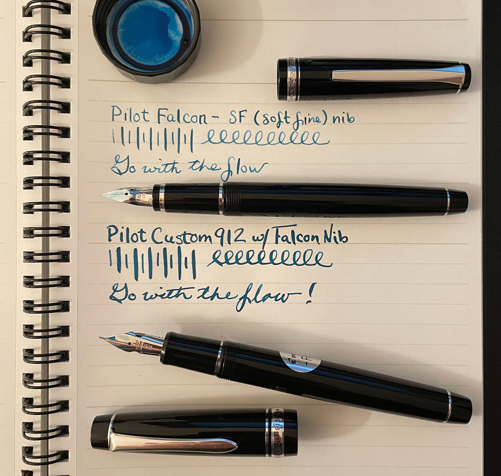 (I used the same ink, Iroshizuku Ku-jaku, in both of these writing samples. The notebook is Mnemosyne.)
Falcon/Elabo
What does "Elabo" mean, anyway? No, it doesn't doesn't mean "falcon" in another language (as I assumed). The name Elabo was created from the Japanese word "erabou," which means “let’s pick” or “choose,” and the English word "elaborate." So, the intended meaning was, "let’s pick this elaborate pen, Elabo!" (Yes, as I mentioned in my "Pilot Pens by the Numbers" article, Pilot's names are a little... creative.)
Elabo was designed in response to a proposal from the National Association of Fountain Pen Specialty Stores asking for a fountain pen nib suitable for expressing Japanese characters, which were originally written vertically with a brush. It took six years to perfect a nib shape that would mimic a brush writing feel and allow a pliancy that would match the average pressure of the Japanese pen.
Pilot's Japanese website describes Falcon/Elabo as "a fountain pen with a soft touch, yet resilient nib that can withstand strong pen pressure. The soft nib, which allows you to vary the strength of the character width with a light force, is also suitable for expressing the words 'stop,' 'spring,' and 'harai,' which are unique to Japanese characters. In addition, the ridge from the center of the nib creates elasticity against pressure, creating a unique writing experience that is both soft to the touch and firm." Fascinating! This special soft yet firm nib is easier to control than Pilot's more extreme FA nib, and is perfect to elevate your everyday writing experience.
I've always especially loved to use my own Falcon for writing cards. When its Soft Fine nib flexes slightly, the thicker flow of ink shows beautiful sheen, and the distinctive look the pen gives my handwriting really conveys "this is a fountain pen!" to people. To flex the Falcon's nib, you have to be deliberate, but it feels natural, not forced. It's a wonderful pen.

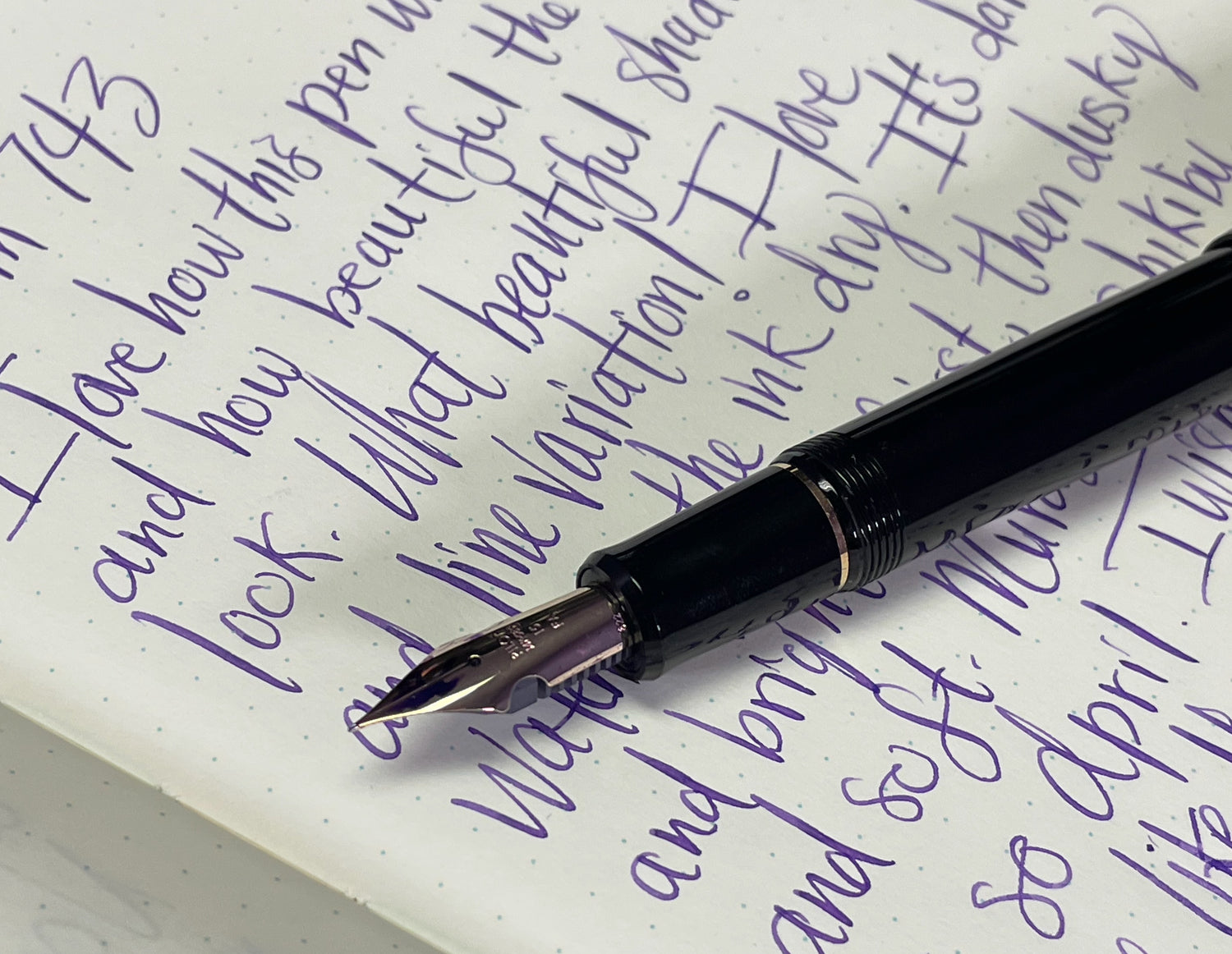
To write this article, I brought home four metal Falcon/Elabo pens to compare all four versions of the soft nib, and I was surprised and impressed by how dramatically different each one is! Many pen brands' different nib sizes are very subtle and it can even be hard to distinguish one from another, but each of these nibs definitely has its own personality, look, and feel. I tested all the nibs on cream-colored Midori MD paper, with Pilot Iroskizuku Murasaki-Shikibu ink. The slight yellow tinge of the paper gave the pretty purple ink an intriguing duskiness.
Next, I tried the Soft Extra Fine nib. I was surprised by how much I enjoyed it, despite how sharp it felt. Even though I could feel a lot more feedback from the paper when I wrote with this nib, it was still very smooth and didn't feel scratchy at all. The slight bounciness made the very fine Japanese nib feel more comfortable. The line variation was more subtle but looked nice!

The Soft Medium nib felt extremely fun and pleasurable to use. It was incredibly smooth and spritely feeling. I loved how it seemed to just flow over the paper. I was kind of shocked by how much I liked the expressive and comfortable bounciness, and how different it felt from my Soft Fine Falcon. The downside to the wider nib is that the line variation is nowhere near as dramatic as it is with the Soft Fine nib, however.

The Soft Broad nib was also a complete pleasure to use, and this nib is extremely wet. Now the color of my ink looked like a ripe and juicy fig. Despite being so smooth, the nib didn't feel glassy and overly slippery. It still offered some feedback, but danced over the page, showing beautiful shading. For me, the Soft Broad line is a little thick for everyday use, but it would be perfect for someone who likes to write large and have fun showing off pretty inks, perhaps in a journal or letters. The line variation is pretty subtle with the Soft Broad nib, and its softness is more about bounce and comfort.

In case you're wondering, writing with a metal Falcon looks exactly the same as writing with the resin one, but the feel in your hand is different because of the variance in weight and balance. The metal pen is 33 g and the resin one is only 19 g. I like the feel of both pens, but I prefer to use the resin pen with its cap posted on the back, and the metal Falcon feels better to me with its cap set aside. The body of the metal Falcon is 19 g without its cap, so no wonder I love both equally! You may have a different preference and think the metal Falcon feels great with the cap posted, if you prefer heavier pens. It's all relative! Both pens are nicely balanced either way.
 (Pictured: Plum Purple Falcon, Sapphire Metal Falcon, and my own rhodium plated Black Falcon, on my orange Girologio mat, with my Iroshizuku Murasaki Shikibu ink bottle and one of my favorite papers to use when writing letters with the Falcon, Clairefontaine Triomphe.)
The nibs and grip sections on the two versions of the Falcon are identical and are actually fully interchangeable, but one big advantage of the metal Falcon is that its slightly larger barrel allows space for Pilot's nicer CON-70 converter. I decided to actually fill the pens (rather than just dip test them) while writing this article because it gives a more accurate representation of how a pen writes, especially with nibs like these, which drink ink quickly. I had never tried the CON-70 before, and now I am a big fan! The converter fills very easily and completely, and holds a lot of ink. I filled one CON-70 and shared it between all the metal Falcons and the 912 and 743. For my own resin Falcon, I used the smaller and less easy to fill CON-40. (All the pens come with their own converters but I didn't want to get them dirty.)

Even though I've loved my Soft Fine resin Falcon for years, trying the metal Falcons and all the different nib sizes had me wanting another Falcon! I usually try to resist such urges, but I am definitely tempted by the metal Falcon with its nicer converter and cool metallic color options, and I was surprised by how much I enjoyed the other nibs. I always thought I'd just choose one Falcon and stick with it, but it really is no weirder to own more than one Falcon color or Falcon nib size than it is to own three Esties in three different nib sizes (as I do), for example. Hmm!

FA Nibs: 912 vs. 743
When I finally tried both FA nibs, I was very surprised to discover just how different they feel, not just from the Falcon/Elabo nibs, but also from each other. It's actually rather shocking.
I tried the Custom Heritage 912 FA nib first, because it's the smaller of the two, and I assumed a larger nib would be more flexible, as there is more length to bend. When I compared the Custom 743, I discovered that I was totally wrong! It felt less flexible. Although it's not obvious from looking at it, the smaller #10 size FA nib is a narrower shape and is made from slightly thinner gold than the #15 size FA nib on the Custom 743, so it bends more easily. This felt very dramatic and unexpected to me the first time I experienced the difference!
My immediate observation was that the #10 size FA nib flexes more often in normal writing and feels harder to write with, or more "out of control." It seems noticeably softer. Custom 743's #15 size FA nib feels firmer, more precise, and more "safe." I felt like the experience of using the #15 size FA nib was about halfway in between the #10 FA and the soft nibs of the Elabo/Falcon. It was so strange how using the Custom 743 made the Elabo feel stiff and using the Custom Heritage 912 made the Custom 743 feel stiff! None of them are stiff, and it's all a matter of perception. I would liken the spectrum of the Elabo, #15 FA, and #10 FA to the feeling of drinking alcohol and progressively getting more relaxed and less restrained.

When I had my colleague Leila (who owns a lot of different pens, but very rarely uses gold nibs) try the Custom Heritage 912's #10 FA nib at work later, she said it felt like the brakes were going out on her car. Ha! Sort of, but the feeling isn't exactly negative. Yes, it's a little disconcerting, but it's also inspiring, exciting, and fun. I think I prefer the more controlled feeling of the Custom 743's #12 FA nib overall, but that's partially because it matches my reserved personality better. They are both wonderful, depending on what I'm in the mood for.
I was also very surprised to discover that the difference that felt so dramatic when I was writing slowly and deliberately seemed to disappear when I wrote expressively!

The more I got used to the nibs and allowed myself to relax, the more I enjoyed writing with them. I tried writing stream of consciousness thoughts with the 743 to see where they would take me, and loved the way the nib helped unlock more spontaneous ideas.

Before too long, I didn't want to be without this pen/nib!

Both the Custom Heritage 912 and Custom 743 are great pens, and, in the grand scheme of things, the personalities of their nibs are their most significant difference, if you ask me! They are both resin and both weigh 25 g, although the Custom 743 holds slightly more weight in its cap, which is a little longer and rounded on top. The Custom 743's grip section is also slightly bigger (10.5 mm vs. 10.0 mm) and has an ergonomic soft touch texture, which is very subtle but nice. It just helps keep your fingers from slipping and adds a tiny amount of cushioning. It's the kind of thing you might not even realize is there, but, once you become aware of it, you appreciate it. Although the 743 is a slightly bigger pen overall (131 mm long, vs. 125 mm for the 912) these differences in size weren't that noticeable to me when I was using the pen, and I found both very comfortable.
 (Pictured, left to right: resin Falcon, metal Falcon, Custom Heritage 912, and Custom 743.)
There are also aesthetic differences between the two pens: Custom Heritage 912 has blunt ends, a sword shaped clip, and silver colored rhodium-plated gold trim, while Custom 743 is a cigar-shaped pen with a ball-style clip and gold trim. Custom Heritage 912 only comes in black, but Custom 743 comes in both black and verdigris green. These are all factors that might make you want to choose one over the other, but, although I went into this article thinking I liked the size and shape 912 more, I ended up wanting the 743 more because the nib suited me better! Obviously, choosing a pen like this is very personal, so your response might be the opposite of mine.


Which To Choose? It Depends on You!
I honestly can't tell you which pen to choose, between a Falcon/Elabo, Custom Heritage 912, and Custom 743. They are all wonderful in different ways. I think you need to think about your personality, your writing style, and what you'd like to do with the pen. As Pilot's Japanese website says, “Character expresses a person's emotions, but the supple touch of [your pen] expresses the writer's heart more honestly.'' If possible, try the pens yourself in our store.
I had a few issues with skipping and railroading when I wrote too fast with these flexible nibs, but, overall, I loved using all of these pens and found them irresistible. They made my handwriting look much more expressive and my thoughts flowed more freely and expansively.
If you want to consider some other nib options for these pens, also check out my article comparing all 15 nib possibilities available for the Custom Heritage 912. My older article also covers the 912's other non-Falcon Soft Fine, Soft Fine Medium, and Soft Medium nibs that are soft versions of the regular Fine, Fine Medium, and Medium nibs. Those options are also available on the black version of the Custom 743, with its slightly larger nib size. Comparing them all was too much for this article, but look at my writing samples and observations in that article if you're curious and your head hasn't already exploded from too much information after reading this one.
I have to confess, this was a very difficult article to write. I loved testing all the nibs and exploring how I felt about them, but this was a lot of information to digest, and trying to communicate everything clearly was challenging. I hope it wasn't too overwhelming or confusing. I wanted to share the wonderful feeling using these nibs gives me, and it was hard to do that without facts and numbers weighing my words down. Trying to write about flexible nibs sometimes felt like the opposite of the buoyant feeling of using them!
I hope you found this article helpful and inspiring. Please share your thoughts and questions in the comments, and, if you have any flexible nib tips, let me know! After writing this article, I definitely want to get one of Pilot's FA nibs, and maybe another Falcon/Elabo, but, like all of us, I'm still learning as I explore.
-Laura P.
 I love comments on my blog! Please leave comments if you like the articles, and, if you have any questions about this article, or any of the other blog articles, you can e-mail support@penboutique.com. Thank you!




11 comments
Christopher Laning
I thoroughly enjoyed the comparison article about the Pilot Falcon vs. Pilot FA nib and the Falcon Elabo Pen nibs! I am new to the fountain pen world and researching now to find my first pen. This article was fun and informative. Thank you so much!!!
I thoroughly enjoyed the comparison article about the Pilot Falcon vs. Pilot FA nib and the Falcon Elabo Pen nibs! I am new to the fountain pen world and researching now to find my first pen. This article was fun and informative. Thank you so much!!!
Ed in Maine
WOW! You really hit it out of the park with this one, Laura! Thank you, and tell your Boss that you just closed another pen sale for Pen Boutique! I have an 823, and now simply have to have a 743. Although the 912 has now risen into my field of view…have to read your blog a couple of more times.
WOW! You really hit it out of the park with this one, Laura! Thank you, and tell your Boss that you just closed another pen sale for Pen Boutique! I have an 823, and now simply have to have a 743. Although the 912 has now risen into my field of view…have to read your blog a couple of more times.
John Ridge
Thank you for the comprehensive look at these Pilot pens and the different flexible nibs. I’ve got a 743 with the FA nib and have been considering the 912 with an FA nib but was worried I would have basically two identically performing pens. Sounds like that is not the case at all. Thank you for breaking down the differences between these pens and FA nibs.
Thank you for the comprehensive look at these Pilot pens and the different flexible nibs. I’ve got a 743 with the FA nib and have been considering the 912 with an FA nib but was worried I would have basically two identically performing pens. Sounds like that is not the case at all. Thank you for breaking down the differences between these pens and FA nibs.
Matt Alley
Hi, Laura; enjoyed your blog today a lot. I’ve owned a couple of resin Falcons and a 912; I’ve given all of them away over the last few years, but really enjoyed your in depth perspectives on the differences. I still maintain that Pilot hampers the 912 with a feed that won’t keep up if you’re flexing very much, but a Flexible Nib Factory replacement ebonite feed takes care of that pretty well. And I have given away at least three Falcons to people who use FPs already but have never tried anything with bounce, much less flex; two of the three people liked the experience and went on to add bouncier pens later and one didn’t like the loss of control at all. :-)
Oh, last thing: a little math geekery. The Pilot No. 15 nib should look 50% larger than the No. 10, while the No. 10 should look 33% smaller than the No. 15. Cheers!
Laura Petix
Thank you so much for your fascinating comment! I’m sorry I didn’t see it until now. I really appreciate both your encouragement and information clarifying the Japanese translation!
Thank you so much for your fascinating comment! I’m sorry I didn’t see it until now. I really appreciate both your encouragement and information clarifying the Japanese translation!
Laura Petix
Thank you so much!
Thank you so much!
Roger
Great blog!
Great blog!
n Sokach
Your article on NIBS shows me how little I know. Thank you.
Your article on NIBS shows me how little I know. Thank you.
Laura Petix
Thank you, Roger!
Thank you, Roger!
Slam Stewart
Thank you for this wonderfully detailed, informative, and enthusiastic article. I learned so much from it about the FA nib and the Elabo (or Falcon) pens. I think you will be interested in some information I can provide to help explain the text you translated from Pilot’s website. Your translation reads: “The soft nib… is also suitable for expressing the words ‘stop,’ ‘spring,’ and ‘harai,’ which are unique to Japanese characters.” This sentence refers to the three ways of bringing a brush stroke to an end in Japanese writing. “Stop,” which is “とめ,” or “tome,” means ending the stroke abruptly by quickly lifting the brush from the paper. “Spring,” or “jump,” is “はね” (hane), which means flicking the brush in an upward direction before lifting it from the paper, so that the stroke ends in a small hook. “Harai” (はらい) means something like “sweep,” and it designates the act of gradually removing the brush from the paper so that the stroke ends by trailing off. If you google “tome hane harai,” you can find many images and videos illustrating these concepts. Keep up the great work. I look forward to reading your blog regularly in the future.
Thank you for this wonderfully detailed, informative, and enthusiastic article. I learned so much from it about the FA nib and the Elabo (or Falcon) pens. I think you will be interested in some information I can provide to help explain the text you translated from Pilot’s website. Your translation reads: “The soft nib… is also suitable for expressing the words ‘stop,’ ‘spring,’ and ‘harai,’ which are unique to Japanese characters.” This sentence refers to the three ways of bringing a brush stroke to an end in Japanese writing. “Stop,” which is “とめ,” or “tome,” means ending the stroke abruptly by quickly lifting the brush from the paper. “Spring,” or “jump,” is “はね” (hane), which means flicking the brush in an upward direction before lifting it from the paper, so that the stroke ends in a small hook. “Harai” (はらい) means something like “sweep,” and it designates the act of gradually removing the brush from the paper so that the stroke ends by trailing off. If you google “tome hane harai,” you can find many images and videos illustrating these concepts. Keep up the great work. I look forward to reading your blog regularly in the future.