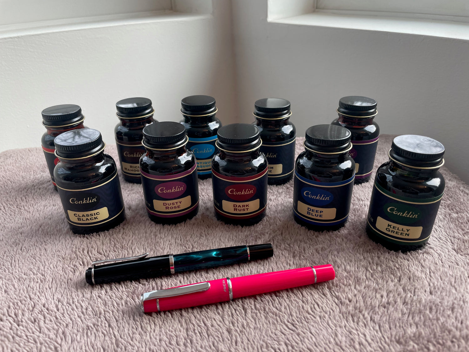
Even more than pens, I love inks, so I was very excited when we got the brand-new Conklin Classic Ink Collection in at Pen Boutique on Thursday. These ten inks have vintage inspired packaging and feature vibrant colors, smooth ink flow, high saturation, a nice mix of hues, and increased cap-off time. The inks are designed to lubricate and protect the nib feeding system from corrosion and clogging, while enhancing writing experience. I swatched them in the store for our Book of Inks right away, but I wanted to bring them home and try them further, so I asked if I could write this week's blog about them.
Well, I now have even more respect for ink blogs like Mountain of Ink and The Well-Appointed Desk, because YIKES! It is a lot of work to test ten inks! I probably should have done it in two groups of five, but I really wanted to share this new ink collection with you right away, so I pushed on. I always tested inks for fun at home before I started working at Pen Boutique, so I already had established my methods and had lots of swatches to compare them to, but working on a deadline and trying to be thorough was a little harrowing! I hope you will enjoy my results and find them useful, even if they are a little less polished than the established ink blogs.
First, let's talk about the bottles! These are nice 60 ml glass bottles with metal lids and they remind me of a mini version of the classic rubber cement bottle (minus the brush inside the cap, of course). I really like the simple 1950s looking vintage style labels and choice of colors. The ten ink colors are Vintage Purple, Kelly Green, Antique Turquoise, Dark Rust, Deep Blue, Rich Mahogany, Denim Blue, Bright Red, Classic Black, and Dusty Rose. That's two purples, two blues, two reds, a green, a brown, and two black/grays, for a very nice variety of colors. (I'm putting Denim Blue in the black/gray category, because it's a lot closer to grey than blue!)
I had fun swatching all the inks on my Col-o-ring cards, using a paintbrush to see how the color ranges from dark to light as the ink ran out, and then using a blunt syringe to drop a few concentrated splotches on each card. (For sheening inks, the splotches really show off the sheen.) Later when the inks were dry and I was reviewing them with a pen, I wrote the name of each ink on the card using my fine nib Pelikan M205. I messed up a few of the cards by writing the name of the ink "upside down" because this took a long time and I was very tired when I was doing the final ones, so for some of them the punch out is on the "wrong" end of the card. Oops!

(Note: for some reason, the color turquoise is very difficult to photograph correctly. Although the other colors look accurate, in real life the Antique Turquoise is a lot more beautiful and intense than it looks in the photo. I find that this always happens with similar turquoise colors!)
Only a few of the inks showed sheen: Deep Blue has pretty orange-ish sheen on the edges of the splotches and on the concentrated end of the paintbrush swatch, Antique Turquoise has a tiny bit of magenta sheen on the edges of the splotches, and both Classic Black and Denim Blue have a small amount of bronze sheen.
These inks aren't about sheen, though: they are about concentrated colors and being very wet and lubricated. I have never used a Conklin pen, so I can't speak for how dry they are, but these are definitely inks designed with a dry writing pen in mind! A lot of my Pilot pens are dry writers, so I appreciate wet inks, but WOW... I've sampled close to 300 inks and these are among the wettest inks I have ever tried in my life!
The first ink I sampled, Vintage Purple, was the wettest, and I got a little concerned that the inks would all be insanely wet. This turned out not to be the case, but Vintage Purple sure is wet. I LOVE the color, and it looks absolutely gorgeous on Tomoe River paper, but it showed through to the other side on my Col-o-ring cards (extremely unusual!) and feathered on the Maruman Mnemosyne blank A4 notebook I used in my tests. Maruman Mnemosyne paper is similar to Rhodia and Clairefontaine, so this really surprised me! I guess this bleed-through comes from the added lubrication? The only ink I have that comes close to being this wet is Noodler's Henry Hudson Blue, which I like to mix with Black Swan in Australian to make a nice juicy mauve that I use in my Pilot Metropolitan for addressing envelopes.
Of the inks in my collection, Vintage Purple is closest in hue to Roher & Klingner Solferino, Colorverse Project Milky Lavender, and Waterman Tender Purple. It's quite a beautiful color!

Here's how Vintage Purple behaved when I wrote with it in the Maruman Mnemosyne notebook. I love the color, but was disappointed by the feathering. As I'll show you at the end of this blog, it was gorgeous on Tomoe River paper. (The second paintbrush swatch in these samples has a little water added, to show how it can look if you use your ink for watercolor style painting.)

Kelly Green, the next color I sampled, was much better behaved and I really liked it in my Pelikan. It was closest to Diamine Inkvent Holly, minus Holly's sheen. This is a very nice color!

Kelly Green even wrote well with my Pilot Prera, a very dry pen. Note that in these writing samples, the Pelikan M205 fine nib is always a lot thicker than the Pilot Prera medium nib! That's because it's a Japanese nib and also writes dry.

Antique Turquoise, the next ink, is an extremely beautiful color, which, as I mentioned, is very difficult to photograph correctly. I managed to get the colors closer to accurate in this photo. It compares with Waterman Inspired Blue, Sailor Manya Sumire, and Iroshizuku Ama-iro, all very beautiful inks.

Writing with this ink was nice with my Pelikan, but it was too light and thin looking with my Pilot Prera. This is a very high shading ink, which looked beautiful on Tomoe River paper but made it hard to read on the Mnemosyne.

I really liked Dark Rust, an unusual color that compared most closely to Van Dieman Rhubarb Crumble, Taccia Ebi, and Pen BBS #393 but was different than all of them.

It had a crazy amount of shading for a burgundy and was very enjoyable to write with. Because the color is much darker than Antique Turquoise, the shading looked great and didn't make anything challenging to read. I also really liked drawing with this ink.

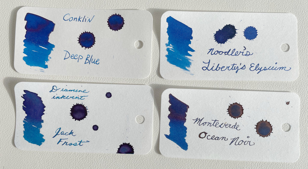
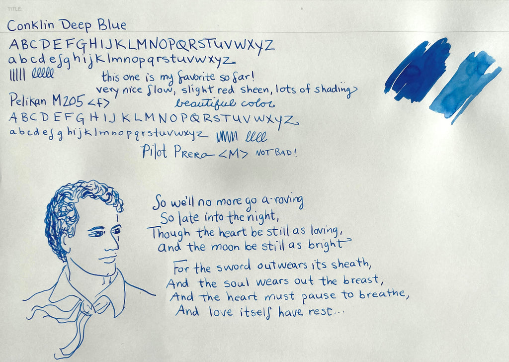
Deep Blue was also extremely nice and became my new favorite. It compares with Noodler's Liberty's Elysium, Diamine Inkvent Jack Frost, and Monteverde Ocean Noir, but is more beautiful than any of them! The touch of red sheen is also quite nice, and not overpowering like some sheen.
This ink had very nice flow and lots of shading. I loved the color!
The well-named Rich Mahogany soon overtook Deep Blue as my favorite Conklin Ink, however. A brown ink is an unusual choice for favorite, but what a brown! It is closest to Scribo Classico Seppia, but is richer and deeper than any of my other browns, and is neither too yellowish nor too reddish.

It also writes like a dream, with very nice flow in both my Pelikan and my picky Prera, not overly wet but quite wet, with pretty shading and just looks beautiful and sophisticated. I wrote in the margin of my page, "best one yet!" I was also especially pleased with my Rich Mahogany drawing.

I'm not sure how I feel about the next color, Denim Blue. It's a very weird color that is far more grey than blue. It's an intriguing color that isn't really like any other in my collection. It's less blue than Scribo Grigio Scribo, and lighter than Diamine Earl Grey. In concentration, it looks black and has a little bit of bronze sheen.

I really liked this color for drawing because it has a lot of shading and is just sort of cool. You can definitely pick up on a slight faded blue element but it's subtle. It's kind of sexy!

Bright Red is another color I found challenging to photograph correctly. It's a tiny bit more pink-y than it looks here, but, true to the name, is definitely a bright red--maybe the purest looking bright red in my collection. It's similar to Diamine Inkvent Candy Cane, but more red (less pink).

I found this ink a little too wet and feathery to write with using my Pelikan on the Maruman Mnemosyne paper, but it was very nice on Tomoe River, with lots of good shading. And it was fun to draw with! I usually don't like red inks, so Bright Red kind of surprised me.

(This image is a little off... it's more of a pure red in real life, but I couldn't get it any closer without messing up how the shading looks.)
I was getting pretty exhausted by the time I reached Classic Black. I liked its degree of blackness, but found it too feathery when I wrote with it. It looked nice on Tomoe River, though, and shaded wonderfully on that paper. As you can see in the swatches, it has a lot more shading than similar colors!

(Note: Poe is hard to draw! I really struggled with this one!)

The last ink, Dusty Rose, brought me back to Vintage Purple. Like Vintage Purple, it's my favorite type of color, but, also like Vintage Purple, this ink is very wet and feathery. It showed through on the other side of the Col-o-Ring swatch card, but looked beautiful in writing on the card, with lots of shading in its mysterious dusky hue. The color is closest to Robert Oster Dusky Pink and Diamine Tyrian Purple, two of my other favorite interesting reddish mauve-y purples. It also reminds me of Monteverde Rose Noir, another one of my all-time favorites for art. I love all four colors in this swatch comparison, but Dusty Rose might actually be my favorite!

On the Maruman Mnemosyne paper, Dusty Rose didn't look very good in writing with either my Pelikan or my Prera, but I loved it for drawing and painting! It also looks extremely mysterious and cool on Tomoe River.

Here are my Tomoe River Paper (52 gsm) writing samples with all the inks. I used both my Pelikan M205 and my Pilot Prera for each color.


I don't think I will be volunteering to test ten inks all at once anytime soon, but I did love being able to do this, and it was especially cool trying a brand-new line of inks that was just released and hasn't been reviewed anywhere else yet. I can't wait to see what other ink bloggers have to say about them! Next time I do an ink review I'll try not to bite off more than I can chew. :-)
-Laura P.



12 comments
Todd
Thank you for the great review. I was curious about these inks and you answered all my questions. I went with the Kelly Green for my Pilot Custom 743 with Falcon nib. Should be a good ink for a flex writing.
Thank you for the great review. I was curious about these inks and you answered all my questions. I went with the Kelly Green for my Pilot Custom 743 with Falcon nib. Should be a good ink for a flex writing.
Scott Jeffrey
Maybe I missed the details, but are any of these waterproof?
Maybe I missed the details, but are any of these waterproof?
Harvey Koontz
My style and standard up ‘til now has been exclusively broadhead nibs and black, very opaque ink – usually Calli or Winsor Newton. My own personal font and lettering patterns are a kind of blend of Fraktur, Half Uncial, and Tolkien’s own lettering on his maps. Your review, however, has just brought a new, bright light sunrise of color into my previously heavy, monochrome, dark environment. I will now have to try a few of these inks you have analyzed.
My style and standard up ‘til now has been exclusively broadhead nibs and black, very opaque ink – usually Calli or Winsor Newton. My own personal font and lettering patterns are a kind of blend of Fraktur, Half Uncial, and Tolkien’s own lettering on his maps. Your review, however, has just brought a new, bright light sunrise of color into my previously heavy, monochrome, dark environment. I will now have to try a few of these inks you have analyzed.
Robert J. Boyle
Thank you for the careful review and the extensive photographs. How would you feel about any of these inks in a vintage pen?
Thank you for the careful review and the extensive photographs. How would you feel about any of these inks in a vintage pen?
Nath D.
I love brown inks, though if they lean too heavy into red territory, I lose interest. The Rich Mahogany from Conklin really seems gorgeous. I need to break out my tiny bottle of Noodler’s #41 Brown to see how it looks next to the Rich Mahogany. And . . . I love the testing methods Laura used here; her Col-o-ring samples look a lot more interesting than mine! (The only thing I wish I could see beyond this is the back side of the Tomoe paper: how much can one see of the writing there, especially with the wetter inks?) Thanks for a great review, Laura!
I love brown inks, though if they lean too heavy into red territory, I lose interest. The Rich Mahogany from Conklin really seems gorgeous. I need to break out my tiny bottle of Noodler’s #41 Brown to see how it looks next to the Rich Mahogany. And . . . I love the testing methods Laura used here; her Col-o-ring samples look a lot more interesting than mine! (The only thing I wish I could see beyond this is the back side of the Tomoe paper: how much can one see of the writing there, especially with the wetter inks?) Thanks for a great review, Laura!
Marcie Lapido
Thanks for the review it was extensive and quite informative. Really like the Mahogany ink as it may my next purchase.
Thanks for the review it was extensive and quite informative. Really like the Mahogany ink as it may my next purchase.
Lisa McLean
You did a superb job even though tired. We got the gist of all the inks and when so many nee colors drop at once it’s helpful to see them all and often not sample, just go straight to bottle purchases.
You did a superb job even though tired. We got the gist of all the inks and when so many nee colors drop at once it’s helpful to see them all and often not sample, just go straight to bottle purchases.
J Michael
I deeply appreciate the very detailed review. Great samples! I’ll end up getting all the colors except for Denim Blue and Classic Black. Deep Blue, Turquoise and Mahogany are my favorites. Dark Rust was the biggest surprise: it’s unexpectedly gorgeous. Thank you for a job well done, Laura!
I deeply appreciate the very detailed review. Great samples! I’ll end up getting all the colors except for Denim Blue and Classic Black. Deep Blue, Turquoise and Mahogany are my favorites. Dark Rust was the biggest surprise: it’s unexpectedly gorgeous. Thank you for a job well done, Laura!
Bernard Freiland
Thank you so much for this testing!!! I loved the analysis and the poetry. And the sketches!!!!! so cool.
Thank you so much for this testing!!! I loved the analysis and the poetry. And the sketches!!!!! so cool.
Dennis Roy
I just got my bottles of Kelly Green and Deep Blue, and these inks are the wettest in my collection! They gush out of my broad nib pens.
I just got my bottles of Kelly Green and Deep Blue, and these inks are the wettest in my collection! They gush out of my broad nib pens.
Dennis Roy
I just got my bottles of Kelly Green and Deep Blue, and these inks are the wettest in my collection! They gush out of my broad nib pens.
I just got my bottles of Kelly Green and Deep Blue, and these inks are the wettest in my collection! They gush out of my broad nib pens.
Susie
Super review! Love seeing all the samples and your drawings. I think my favorites are dusty rose and rich mahogany!
Super review! Love seeing all the samples and your drawings. I think my favorites are dusty rose and rich mahogany!