


For my article this week, I decided to do something I've never done before: choose comparable pens from three different brands and compare them, focusing on the nibs and the writing experience. The "big three" Japanese icons Pilot, Platinum, and Sailor are all highly respected for the quality of their gold nibs, and all three make their own nibs in-house. Pilot makes their nibs in Hiratsuka, Platinum in Tokyo, and Sailor in Hiroshima. Each brand's nibs have a distinct feel, so each one has its loyalists. I think all three brands are great, and I was curious to more fully understand the nuances between the writing experience each one offers.
I chose three entry-level 14K gold nib pens that are similar in size and price:
-
The Pilot Custom 74, Pilot's core introductory pen in the Custom series, which features Pilot's #5 size nib and retails for $250. This nib is slightly larger than the size of the nib shared by Pilot's popular steel nib pens, the Kakuno, Explorer, and MR (Metropolitan).
-
The Platinum #3776 Century, which features Platinum's #3776 nib and retails for between $220 and $300 for its base model.
-
The Sailor 1911S, Sailor's cigar-shaped 14K gold nib pen, which starts at $275.
(The prices I've quoted are the retail prices at the time of this article's release. Prices will vary with sales and price increases.)

All three are cigar-shaped, screw-cap, resin pens with precious metal trim and proprietary cartridge/convertor filling mechanisms. The Sailor 1911S is the slimmest and shortest, while the Platinum #3776 and Pilot Custom 74 are close in size (the Custom 74 is slightly taller, but the #3776 is slightly thicker).
Platinum's #3776 nib is closest in size to Pilot's #10 nib, but it is Platinum's smallest gold nib, and I'm comparing introductory gold nib pens from the three brands, so this was the most fair way to do it, as Sailor's larger nibs are 21K. Sailor's 14K nib is very similar in size to Pilot's #5 nib.

Important note: I used the Sailor 1911S for my model in this article because it looks and feels most similar to the Pilot Custom 74 and Platinum #3776 Century, but the Sailor Professional Gear Slim uses the exact same nib as the 1911S, so anything I say about the 14k Sailor nib would apply to both pens. The Pro Gear Slim is a flat-topped pen that is shorter than the other pens in this article. Its price also starts at $275, and it comes in a lot more color variations than the 1911S does.
This article isn't a face-off, and I didn't go into it trying to pick a favorite. I enjoy using different nibs at different times, and I feel my collection is more well-rounded when I have a variety of pens and nibs. I hope you will enjoy exploring the similarities and differences along with me, and that it might help you choose which nib to try next. I didn't have much experience using Platinum nibs before writing this article, so I was especially excited to get to know them better and compare them to the Pilot and Sailor nibs I already know and love.
For this article, I decided to only compare Fine and Medium nibs, because those are the most popular nib sizes from all three brands, and time limitations didn't allow me to try every nib option available. Extra Fine and Broad nib lovers, I apologize!
Spoiler alert: I ended up "penabling" myself and bought one of the pens I tested while writing this article, so be forewarned... you may be tempted, too!
A Little Background
Sailor was founded in 1911, Pilot in 1918, and Platinum in 1919, so all three are very well established, and have worldwide reputations for quality. Pilot and Sailor are more well-known in the United States than Platinum is, but they all produce exceptional fountain pens that range from inexpensive steel nib pens that are perfect for introducing new fountain pen lovers to the hobby (such as the Pilot Varsity/Kakuno/Explorer/MR, Platinum Preppy/Plaisir, and Sailor Compass series), all the way up to incredible maki-e Urushi lacquer masterpieces made by highly skilled artisans, costing well over a thousand dollars.
Japanese nibs in most cases are said to write about one nib size thinner than their western counterparts. (For example, the line width when writing with a Japanese Medium nib is usually approximately equivalent to Fine nib from a German, Italian, or American brand.) For the most part, I have found that to be true in my experience, and I was quite interested to see if all three pens' line width would be the same or not.
Before I describe my experience of writing with the pens, I wanted to share a few more details on the three entry-level 14K gold nib pen models I chose to compare. I selected these three pens because they would each be a perfect choice as a first gold nib pen from Pilot, Platinum, or Sailor. I think they are all excellent pens and would not hesitate to recommend any of them, but each one has its own distinct spin on the same general concept, and one may appeal to you more than another.
Pilot Custom 74
The Custom 74 is the oldest of Pilot's currently produced Custom models and was conceived as Pilot's core introductory pen with a simple but sophisticated, minimalist design. An early catalog says it was “designed to be a fountain pen in its most honest and pure form." Like many other Pilot pens, its name takes a little bit of math to understand. The first two digits of Pilot's number names are anniversary numbers, so, you can calculate 1918 + 74 = 1992, and you know that Custom 74 was originally released in 1992, the 74th year of Pilot's existence. (If you are curious about some of Pilot's more complicated number names, check out my Pilot Pens by the Numbers article.)
The Custom 74 is a pretty straightforward pen, which is great for people who are newer to the hobby and don't want to be overwhelmed by choices! It's also extremely reliable. I've had one for five years and have never had a problem with it. It's an extremely smooth and consistent writer and always starts right up when I want to use it. Pilot is proud of its reputation for writing perfectly right out of the box, and is well known for the smoothness of its nibs.
Currently, all the models available to the US market are translucent demonstrators with silver-colored rhodium-plated gold nibs and trim. Like Pilot's other "Custom" pens, the Custom 74 is cigar shaped and has a ball-shaped clip. The end finials and grip section are a contrasting translucent grey, a nice touch that adds visual interest and balance to the pen, and gives it a contemporary and friendly look. The Custom 74 looks sharp! [Pictured: Pilot Custom 74 in Teal.]
The eight translucent colors are Blue Stone, Merlot, Grenadine, Blue, Forest Green, Clear, Smoke, and Teal. The pens are especially beautiful when the sun shines in the front door of our store and lights them brilliantly. They really sparkle! If you love being able to see inside your pen, or if you want a gold-nib Pilot with a lot of color choices, the Custom 74 is perfect.

The nib sizes for the Custom 74 are limited to Extra Fine (EF), Fine (F), Medium (M), and Broad (B). I think it's good that Pilot keeps the nib choices pretty simple with this pen. For a Pilot with 15 different nib options, you can step up to the Custom Heritage 912 with the slightly larger #10 nib.The Custom 74 uses proprietary Pilot cartridges or a CON-70 convertor, which combines the characteristics of a vacuum-filling and push-button converter and holds about 1.1 ml of ink. The Custom 74 weighs about 23 g with a converter full of ink and is comfortable either with the cap set to the side or posted on the back of the pen.
Platinum #3776 Century
The Platinum #3776 Century was designed by the late writing expert Haruo Umeda with the design team at Platinum, with the aim to create the ideal fountain pen. It's a little heavier than the Custom 74, at 25 g with a converter full of ink, and is also comfortable either with the cap set to the side or posted on the back of the pen.
The #3776 Century takes its mysterious number name from the height of Mt. Fuji in meters, and the name can be said in a few different ways. Bryce, our rep from Luxury Brands (distributor of Platinum in the US) and I both say it "three seven seven six." The nib features a stylized Mt. Fuji outline, which is quite cool! I also love the heart-shaped breather hole.

The #3776 Century has the original screw cap version of Platinum's "Slip & Seal" technology (famously used in the snap-cap Preppy), which is the industry leader in keeping your pen from drying out. Originally, “#3776 Century” was the designation specifically given to models in the #3776 line that were fitted with the Slip & Seal mechanism (the "Century" part of the name referred to the fact that the brand was approaching 100 years old at the time), but now all models in the #3776 line are branded #3776 Century, even though there are a few fancy designs that don't use the Slip & Seal cap liner. The standard resin pens I'm focusing on in this article do all have Slip & Seal caps, so don't worry about those rare exceptions unless you become obsessed with the #3776 Century and start researching all the variations like I did!Note that the Platinum #3776 Century nib comes on all the #3776 Century pens, which range from its core resin pens, all the way up to its limited edition, celluloid, and Urushi #3776 Century pens that can cost over $1,000. I'm using standard resin #3776 Century pens in this article.
 [Pictured: Platinum #3776 Century Bourgogne with gold trim.]
Bryce told me that Platinum's nib production in Tokyo is a 16 step, 2.5 day process to make one nib, and that Platinum uses more gold per nib than Sailor or Pilot. The nib extends farther into the grip section, as well. Bryce says this gives the user "that famous and lovely Platinum feedback from the pen!"
The #3776 Century is available in a very interesting range of nib sizes: Ultra Extra Fine (UEF), Extra Fine (EF), Fine (F), Soft Fine (SF), Medium (M), Broad (B), Coarse (C), and Music (MS). Coarse is like a double Broad. The more unusual nib sizes are only available with some versions of the pen.
Since I only tried Fine and Medium for this article, I asked Bryce to tell me a little more about the Soft Fine nib option. He said it's more flexible than the regular Fine. It isn’t a flex nib, but gives some bounce to your writing. I've tried Pilot's Soft Fine nibs in the Custom Heritage 912 and Falcon, and I think that's a pretty good description of a "soft" version of a nib. A soft nib also introduces a subtle amount of line variation to your writing if you exert a little more pressure on your downstrokes, is a little wetter, and shows more sheen and shading. They are less precise feeling, though, and are more prone to feathering. Soft nibs were designed for writing Japanese characters with short, expressive strokes, but they can be fun to use in Western style writing, too.
About six months after I originally wrote this article, I was able to try all eight nibs at Luxury Brands' DC Pen Show table. I especially loved the Soft Fine!

The standard resin version of the #3776 Century comes in opaque, translucent, and transparent colors with various nib and trim colors. We don't keep a lot of them in stock, but we can easily order them and get them quickly for you! Just ask.
Each one has a number designation!
-
#1 Black - opaque black with gold trim or rhodium trim
-
#2 Chenonceau White (inspired by the Château de Chenonceau in France) - opaque white with gold trim
-
#5 Oshino (inspired by the clear water from the village of Oshino in Japan) - clear with rhodium trim
-
#5 Nice (inspired by the resort area in Southern France) - clear with rose gold trim
-
#7 Black Diamond - translucent black with rhodium trim
-
#41 Laurel Green (inspired by traditional laurel victory wreaths) - translucent dark green with gold trim or rhodium trim
-
#51 Chartres Blue (inspired by the stained glass windows of the Chartres Cathedral near Paris) - translucent dark blue with gold trim or rhodium trim
-
#71 Bourgogne (inspired by the color of rich burgundy wine) - translucent dark burgundy with gold trim or rhodium trim
-
#87 Nice Lavande (inspired by the beautiful fields of lavender that blossom across the French Riviera in early summer) - transparent lavender with rose gold trim
I would not call Platinum's translucent #3776 pens true demonstrators. They are dark colors that are much less see-through than Pilot's Custom 74, so you can only faintly see the converter through the barrel and nib through the cap. They become a little more visible in bright light, but, in most situations, the translucency only allows a glimpse of the inside of the pen, but gives the material a nice glowy look. The three transparent models inspired by Nice, France, and Oshino, Japan are much more see-through.
Limited edition versions, such as the current Coffee Jelly, Fuji Shunkei Uroko-Gumo, and Shape of A Heart - Bluebird, may have two-tone cap and body colors, and those come in lovely box sets accompanied by special matching limited edition Platinum mixable ink. There are also more expensive celluloid and Urushi lacquer models, but those are outside the scope of this article.
The Platinum #3776 uses proprietary Platinum cartridges or Platinum's convertor. It's the same converter you can buy for a Preppy, but take note: if you have already used a converter in a Preppy, it won't fit tightly in your #3776 because the Preppy will stretch out the opening a little. I found this out when I re-used one of my own converters so I wouldn't get the Platinum #3776's converter dirty while testing the pen. But, don't worry... the #3776 comes with its own converter in the box, as do the Pilot Custom 74 and Sailor 1911S.
Sailor 1911S or Professional Gear Slim
Sailor's 1911 (named for the year the Sailor Pen Company was founded) and Professional Gear pen models are adored by Sailor devotees, who get very excited about the myriad of color and trim combinations available for these fun and beautiful pens. These models are in most cases more expensive than the Pilot and Platinum pens I'm comparing them to, but they have a dazzling number of options to choose from, with many, many different color combinations, including two-tone cap and body, contrasting end finials, glitter, metashine (a dust-fine shimmer), opalescence, and elements with varying degrees of translucence.
The nib and trim on Sailor's 1911 and Professional Gear pens also have many variations, with different shapes to the metal cap ring, ringless versions, unique images on some finials, two-tone nibs, and many different trim colors including different shades of yellow gold, silver (rhodium plated), black ion plated, antique gold plated, rose gold plated, two-tone, and who knows what else! Sailor is so full of new ideas and surprises, it can be overwhelming at times. While Pilot and Platinum stick to their core colors, with a few special editions every once in a while, Sailor releases pens many times a year and there is always something new on the horizon.

At every Sailor pen's core, though, is its nib. Sailor is famous for the quality and consistency of their nibs, and also for the distinctive feel of these nibs. When you write with a Sailor, you will experience what is called "feedback," which describes both the feel and the sound of your nib moving over the paper. Scott, our Sailor rep, calls this "the song of the Sailor." Feedback is similar to the sensation you get when you write with a sharp pencil. Some companies choose to highly polish the tipping material at the end of their nibs for a smooth and glassy feel on the paper, while Sailor manufactures their nibs' tipping with more texture to provide feedback.
Some people really love feedback, because it provides you with more feedback--i.e., you feel more in touch with the paper and more aware of how your nib is moving over the page. It's kind of like how you are more in touch with the road when you drive a sports car than when you drive a luxury sedan designed to isolate you from the noise and texture of the road and give you a quiet and cushiony ride. The Sailor nib's tactile and auditory information can help you write or draw more precisely, or can just be enjoyable to you as a sensation.
Feedback is different from being scratchy, but it is something many people have strong feelings about, either positive or negative. If you want to feel your pen gliding silently over the page, a Sailor may not be the pen for you. I thought I didn't like feedback at first, but it grew on me and now I appreciate it. I own several Sailors and love the precision of the nibs and the unique feel of using them!

[Pictured: Fried Egg Jellyish 1911S (foreground) with my own Professional Gear Slim and 1911S. These two colors are no longer available.]
Sailor's 1911L, Professional Gear standard, and King of Pen pens feature larger 21K gold nibs. My observations in this article will only apply to the 14K gold nib, which is smaller, firmer, and less juicy than Sailor's 21K nibs. You can learn more about all of Sailor's 16 standard nib sizes in my article, Getting to Know Sailor Nibs.
The 1911 and Professional Gear models are available in Extra Fine (EF), Fine (F), Medium Fine (MF), Medium (M), Broad (B), Music (MS), and Zoom (Z), but the more unusual nib sizes are only available with some versions of the pens. Like the Pilot and Platinum pens I'm comparing them to, they use proprietary Sailor cartridges and come with a proprietary convertor.
Trying the Pens
To level the playing field, I gave all six nib sections a bath before starting my comparison tests. It's always a good idea to clean a new pen's nib before you use it, and I wanted to be sure every nib was equally clean. I had dip-tested a couple of the pens in the store, and it wouldn't be fair if those pens had any remnants of ink on the nib or in the feed. Some new fountain pens also come with protectant oils on the nibs, lubricants from the manufacturing process, or residual ink from being tested in the factory. I'm not aware of that being the case with these three brands, but cleaning your nib is still a good thing to do just in case.

I cleaned them with plain room temperature water and allowed them to dry nib-down overnight. You can also use a drop of dish soap if oils are keeping your new nib from holding ink correctly. I usually only use pen flush if my nib is especially dirty, like from a shimmer ink, dried on ink, or especially stubborn sheening ink, but it can be very helpful at times. It can also be very helpful to soak your nib section overnight in water to loosen up ink, or use an ultrasonic cleaner (not safe for some pens, so use caution), but that was not necessary for these pens, of course!
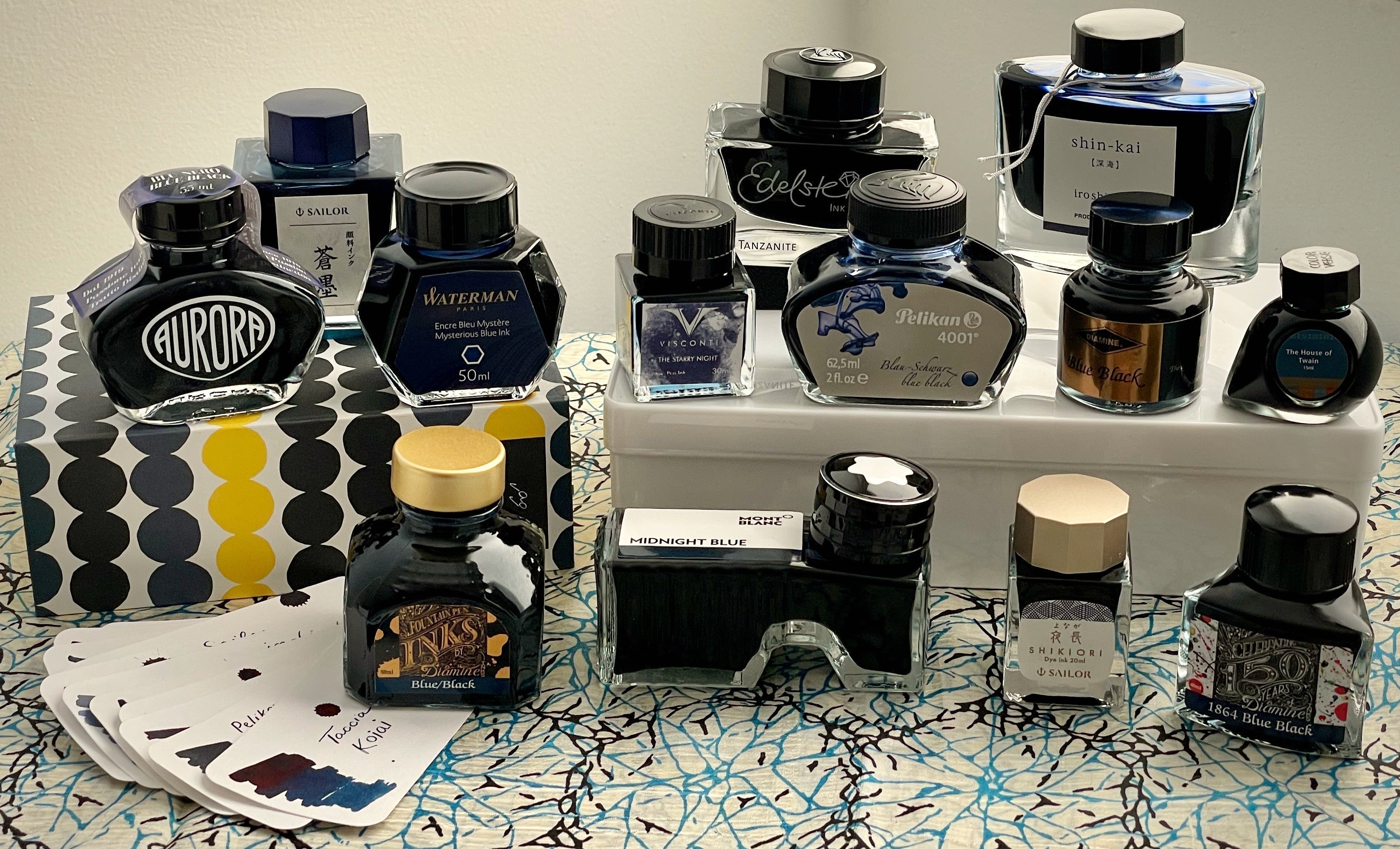
For a fair comparison, I also needed to use the same ink in every pen, so I couldn't use the pens' proprietary cartridges or ink bottles, even though they most likely write best with their own brand of ink. Inspired by my recent Blue-Black article, I decided to use Aurora Blue Black ink. I don't know if that ink is equally compatible with all three brands, but at least it's a neutral brand (not Pilot, Platinum, or Sailor). I also decided to use the pens' converters for a true test, rather than just dip testing them. To avoid getting the converters that came with the pens dirty, I used my own converters.

[Top to bottom: Pilot Custom 74, Platinum #3776 Century, and Sailor 1911S with their converters. Pilot's CON-70 is a push button converter, and Platinum and Sailor's have a twist piston. They all fill well.]
I was surprised to discover right away that the Sailor nibs' line widths were significantly narrower than Pilot's and Platinum's in both the Medium and Fine nib pens!


I asked our Sailor rep, Scott, about Sailor's line widths, and he sent me some information about the exact width Sailor's nibs are said to write. The numbers Scott gave me are: EF Extra-Fine .23mm, F Fine .30mm, MF Medium-Fine .36mm, M Medium .50mm, B Broad .60mm, MS Music 1.15mm, Z Zoom .25-.70mm. Of course, this will vary a little depending on the ink you use and how absorbent your paper is.
Scott's information also stated that "the Fine nib is finer than those seen in most contemporary pens, and the Extra-Fine is similar to those found in pens of the 1920s. The Medium-Fine, meanwhile, offers a handy alternative--it is similar in size to the standard Fine of other Asian pens, and is just slightly finer than the Fine rating of most European pen makers, so it is a great choice for those who want a fine point that is not scratchy." I wasn't aware that Sailor nibs are finer than other Asian nibs, so this was very cool to find out! I had actually heard that Platinum nibs are finer than other Asian brands, but this turned out not to be the case! (Note that Platinum does offer the Ultra Extra Fine (UEF) nib, however, which Sailor and Pilot don't. I didn't test that nib for this article, though.)
All six pens wrote well, and none of the nibs were poorly tuned or scratchy, but there was a noticeable difference in both the look and the feel of the writing. I decided to try some longer writing and cursive letters. I'm not very good at cursive, as I don't often use it. Please forgive my struggles with "x"!


The appearance of a nib's writing can vary a great deal depending on what ink and paper you are using, so this is only one example of how these pens write. The line width, shading, sheen, and darkness of the letters would look completely different with different ink and on a different kind of paper, but I am comparing all three pens on the same paper (Clairefontaine Triomphe) and with the same ink, Aurora Blue Black.
The Pilot's writing shows the most shading and sheen (the sheen doesn't really show up in these photos, but, just trust me; you can see it if you look at the paper from an angle), and looks slightly thicker than the Platinum's writing. Platinum's looks the most crisp and consistent. It also shows some sheen in the Medium nib writing, but not much shading. The Pilot shows a small amount of line width variation. The writing looks lighter in the Sailor pens because the nibs are finer and less wet, so the ink is less concentrated. The Sailor shows some shading with the Medium nib.
Next, I decided to write some freeform thoughts and really focus on the feel of the nibs. It was a very interesting experience to be focused on the nib specifically, rather than the appearance of the pen! I honed in on the senses of touch and hearing, instead of sight.

The Fine Pilot nib feels bouncier than the other two nibs, and dances over the paper. I can feel a wetter flow of ink with the Pilot than with the Platinum. However, the nib has a slightly stricter "sweet spot," so I need to be a little more careful with the angle at which I hold the pen, or I don't get good contact with the paper. It feels very smooth, but has just enough feedback so as to not feel glassy or slippery.
I was shocked by how much I loved the Platinum #3776 Century from the moment I started writing with it. The more I used it, the more I wanted one. There is just something about the feel of the nib that really appeals to me and feels so good. It feels slightly stiffer and more precise than the Pilot nib, and has a little more feedback than the Pilot. I especially noticed that I can feel the tip more. That may sound strange, but I don't know how else to explain it. Something about the shape of the nib just makes me feel more focused in on the pointy part of it when I am using it! The flow of the ink and the feel of weight of the pen in my hand also feels extra satisfying.
The Sailor nib feels the sharpest and driest. It is not scratchy, but feels extremely precise and has the most sensory feedback, which Sailor is famous for. The feedback is both auditory and tactile. I can feel the texture of the paper and hear my nib moving over it. It makes me feel very in touch with my writing, and it is fascinating to experience. I have the most control with this nib and can produce the most detailed output.

Experiencing the Medium nibs was similar, but the differences were slightly less pronounced.
Pilot Custom 74's Medium nib is extremely smooth and rich feeling, and I love watching the ink glistening on the page as I write. Again, the nib felt like it was gliding over the paper, and I wrote that it reminds me of ice skating on a smooth pond: I can feel the ice, but I fly over the surface. The visible sheen and wetter flow are very enjoyable!
The Medium nib Platinum #3776 feels more deliberate, slower, and controlled than the Pilot nib. It's very smooth. I like the feel of its medium wetness, and I enjoy being able to subtly feel and hear feedback from it. Again, I observed that the nib feels stiffer than the Pilot nib and that the point feels pointier! This nib brought me a lot of pleasure.
The 14K Sailor Medium nib is much wetter than the Fine version of the same nib, and doesn't look or feel as extreme as the Fine nib does. I experience a lot more feedback than with the Pilot or Platinum nibs, and feel very in touch with the paper. The auditory part of the experience seems like something someone who loves ASMR might appreciate! I don't really experience the "tingly" ASMR feelings some people get from certain types of sounds (except when I get chills/goosebumps from opera sometimes!), but I still find it enjoyable to listen to. (Some people will hate the sound, though, I'm sure. It can be a very polarizing thing.)
I did one more comparison for you: each brand's own nibs compared to each other. I hope this will help you select which nib is right for you!

Penabled
As for me, I've written a lot of articles about Pilot pens and own quite a few Pilots, and I love my Sailor pens as well. However, I didn't own any Platinums other than a Preppy which I use for testing inks on occasion, and writing with these six pens made me really want a Platinum #3776! There was just something about that #3776 nib that I couldn't stop thinking about. I loved both the Fine and Medium versions, but decided I wanted a Fine the most, because, even though the Medium felt so good, I was crazy about how precise the Fine felt when I was drawing.

After I tested these nibs, I knew I had to add a Platinum #3776 to my collection. I don't buy new pens very often and I'm very deliberate in my choices, so this was no impulse buy. Even when I should have been going to sleep, I instead lay in bed with my laptop, looking up all the different versions of Platinum #3776 Century that are available. I knew I wanted a Fine. The nib was the most important part of the pen for me. But my pen collection is very curated and I wanted a color that really spoke to me. I wanted to think about it carefully before deciding. Finally I realized which Platinum #3776 I wanted: the limited edition Coffee Jelly pen, which is only around for a short time longer. On Monday the 17th, when I was about halfway through my work on this article, I bought one. As I drove home thinking about my new pen, I realized how much I love the sophisticated combination of the luminous coffee-colored cap, finial, and grip section--which are translucent but only in bright light--and the rich deep dark cherry colored barrel. It's a strong and confident pen, well-balanced and calm. It looks patient and level-headed, but also as if it enjoys simple pleasures, like the delicious Japanese dessert it's inspired by.

The coffee jelly dessert is a beloved menu item at kissaten (喫茶店), Japanese retro-style cafes, and is made with sweetened black coffee and gelatin or agar-agar served topped with fresh cream, whipped cream, or condensed milk, sometimes with a cherry or cocoa powder on top. I've never eaten coffee jelly (yet!), but coffee is one of my favorite small pleasures, and I have so many happy memories of enjoying coffee and desserts at small cafes, so it's no wonder this color combination makes me feel peaceful, joyful, and connected to good feelings from the past.

The Coffee Jelly #3776 is the first of a new limited edition series from Platinum called "My Favorite Things," and is limited to 2,000 units worldwide. It comes in a nice boxed set accompanied by a 20 ml bottle of specially formulated Platinum Mixable Ink called "Dark Syrup." It's the color of dark grade maple syrup, which is used to add sweetness to the coffee jelly dessert. I filled my new pen on Tuesday, and the pen and ink are ideal together! The ink color is a perfect match for the barrel of the pen, writes beautifully, and has lovely subtle shading. I don't know why it took me so long to discover how great the Platinum #3776 Century is! Pilot and Sailor definitely deserve their reputations and the love and loyalty of the fountain pen community, but so does Platinum. My new pen already seems at home in my collection and I'm happy to have expanded my horizons yet again.
-Laura P.
I love comments on my blog! Please leave comments if you like the articles, and, if you have any questions about this article, or any of the other blog articles, you can e-mail support@penboutique.com. Thank you!


16 comments
Phil
Great article. I very much enjoyed reading it. My preference for a slightly larger pen size and nib size than the Pilot Custom 74 or Sailor 1911s have lead me to owning and extensively using a Pilot Custom 823, Sailor 1911L and Platinum #3776 although they all have different nib widths.
These relatively larger nibs seem to have many of the same characteristics as their smaller siblings and the brand as a whole while also having some differences in feel to the smaller nibs, particularly in springiness. I wonder if the larger 21k Sailor nib is more comparable in line width due to being softer than the smaller 14k nib? I also tried a Pilot 845 with its 18k nib at some point, but can no longer remember if there was a significant difference in writing experience.
Thanks again.
Syaz
Thanx for lovely article..
Thanx for lovely article..
MikeS
Great, in-depth review. This should get me much closer to a decision. Thanks!
Great, in-depth review. This should get me much closer to a decision. Thanks!
Eric Arnold
I searched back through my collection to see where I stand, as you and I have a running joke about your predilection for pens that have “P” or “L” in their name (for those unaware, Laura has a preference for Pilots and Pelikans). Hardly a surprise you’d end up with a Platinum, just like Pilot and Pelikan it has both! Anyway, I looked at how many pens I have of each brand, as well as how frequently I have used each of them (thanks for pointing me to the “Fountain Pen Companion” website by the way, it is an exceptionally useful resource!). I have been very focused on Pelikan in the last year or so (those pens just work, every time), and the stats bear that out. I have double the number of Pelikans than I have of any other brand. Both Pilot and Sailor are virtually tied at half that number. I have but one Platinum. So in some sense my collection bears out your assessment, in terms of brand awareness.
From a usage standpoint none of these three brands is on top. That makes some sense; I use my Parker IM Monochrome daily for writing postcrossing postcards (with Sailor sei-Boku!), and my Waterman Carene daily in my bullet journal. But I was surprised to see that Sailor was next; that 1911L Stormy Sea with Robert Oster’s Great Southern Ocean gets more use than I thought! I would have thought it’d have been a Pelikan.
I really liked your Platinum 3776 the other day (very kind of you to let me try it!), and it was fortunate that I was carrying the Stormy Sea at the time, so I could do a direct comparison. I’ll call you later about ordering a Chartres Blue, which seems to be out of stock. As always, thanks for your exquisite attention to detail and delightful writing style! See you at the Baltimore Pen Show!
Shlomo Beinart
Hi
I have a question about bleed through with these pens. since i use moleskine paper it ’s a real issue. which one of them works best?
thank you
Hi
I have a question about bleed through with these pens. since i use moleskine paper it ’s a real issue. which one of them works best?
thank you
K
I loved reading this. It was a very pleasant informative well thought out bunch of information. I’ve been wanting to play with some pilot pens but now I also want to check out platinum. I love my sailor I recently bought in shop.
I loved reading this. It was a very pleasant informative well thought out bunch of information. I’ve been wanting to play with some pilot pens but now I also want to check out platinum. I love my sailor I recently bought in shop.
Gloria Fruit
Really excellent article, Laura. This is exactly the kind of comparison of nibs that I hope to find on pen sites, and have even requested from time to time, but this was the first detailed comparison I have seen. I came away from the article also liking the Platinum, and now am considering purchasing one in the future. The Pilot Vanishing Point is my favorite pen. I would be interested in seeing some comparisons of the different models of the Vanishing Point, with perhaps some consideration of the Pilot Deçimo, a similar model. Perhaps a topic for future consideration.
Many thanks for this interesting article.
Tsilveira
I concur with your very detailed review of these pens. I especially agree with your findings about the feel of writing with a Sailor nib. For me, that feedback and sound is a tad too much. Having said that, I respect everyone’s choice of what they choose to experience when they write with a fountain pen. It’s what makes the world a wonderful place, varying opinions and tastes.
I concur with your very detailed review of these pens. I especially agree with your findings about the feel of writing with a Sailor nib. For me, that feedback and sound is a tad too much. Having said that, I respect everyone’s choice of what they choose to experience when they write with a fountain pen. It’s what makes the world a wonderful place, varying opinions and tastes.
Colin
My first experience with the 3776 was a mistake, but a happy accident. I had been given a box with some pens that had been in a desk drawer. Three of them were fountain pens, but they had dried ink in them and I didn’t pay much attention, since I was more interested in the mechanical pencils in the box.
Last year, when I started collecting fountain pens, I cleaned up the ones from the box. Two are Waterman (Paris) Phileas Blue Marble editions with Medium #6 steel nibs, and both write beautifully. But the Platinum 3776 has a nib I’d never seen before. It has three tines and makes lovely wide/thin line variations while writing in cursive. Yes, a 14k Music nib! What a treat it is to have something so off-beat to play with and learn to use. It is an older, opaque black pen with gold trim, but even so is very handsome since I’ve polished it up.
Of course, now that you’ve shown off your Coffee Jelly version, it is back in my mind again. Now I’ll need to stay away from my computer late in the evening (when my pen resistance is down).
Terence GF Flynn
I have different models of each of the Big Three and like them all.
If I needed to select just one, I would pick Pilot then Sailor, then Platinum.
I did notice that the Pilot had the darkest of the look of the ink, then Platinum, then Sailor.
The difference between the Pilot and Sailor looks extreme and gives the impression of being different inks.
Thank for your time in these postings.
P
This was a great article! I’ve e been hesitant to buy one of these brands sight unseen not knowing much about the differences in the nibs and how they write.
Love the thoroughness of Laura’s and appreciate all the effort and research she puts into her blogs.
This was a great article! I’ve e been hesitant to buy one of these brands sight unseen not knowing much about the differences in the nibs and how they write.
Love the thoroughness of Laura’s and appreciate all the effort and research she puts into her blogs.
Edward Rutledge
I’m a fan of wide ink lay down and have read the Platinum music nib is fantastic. Do you have any B+ Platinum nib experience? Do the wider nibs come with $$ up charge? This would be my first venture into gold nibs, so I’d rather not make an expensive mistake going broad, but braid is my preference.
I’m a fan of wide ink lay down and have read the Platinum music nib is fantastic. Do you have any B+ Platinum nib experience? Do the wider nibs come with $$ up charge? This would be my first venture into gold nibs, so I’d rather not make an expensive mistake going broad, but braid is my preference.
Jim Edwards
Thank you for the nib article. I am a fan of shading and sheening inks and gravitate towards medium nibs. I own a Pilot 912S and love the softness of the nib. A favorite writer was a recent grail purchase of mine and this pen holds its own against my KOP and my M1000. I bought a used Namiki Falcon a few months ago and it is my daily writer. Its inked with Yama Budu and currently on Mitsubishi Bank Paper. Very sweet.
Thank you for the nib article. I am a fan of shading and sheening inks and gravitate towards medium nibs. I own a Pilot 912S and love the softness of the nib. A favorite writer was a recent grail purchase of mine and this pen holds its own against my KOP and my M1000. I bought a used Namiki Falcon a few months ago and it is my daily writer. Its inked with Yama Budu and currently on Mitsubishi Bank Paper. Very sweet.
Minna&Louie
Excellent article. I too love Platinum pens and have an ef ,c and music nib. I think that they are underrated and under appreciated.and your article is going to change that! Enjoy
Excellent article. I too love Platinum pens and have an ef ,c and music nib. I think that they are underrated and under appreciated.and your article is going to change that! Enjoy
Chris
Great article. Appreciate the time to provide all the detail. Agree with your nib assessment. I prefer Pilot nibs over my Sailor & Platinum. In the hand they are the softest. Which I prefer over stiffer. Understand that stiffer, like a sports car, is more precise. I prefer Sailor over Platinum as I enjoy the feel of the Sailor nibs on paper. Best nib feel. BTW I do have a soft fine Platinum 3776, which I feel is stiffer than the standard extra fine I have. Thanks again.
Great article. Appreciate the time to provide all the detail. Agree with your nib assessment. I prefer Pilot nibs over my Sailor & Platinum. In the hand they are the softest. Which I prefer over stiffer. Understand that stiffer, like a sports car, is more precise. I prefer Sailor over Platinum as I enjoy the feel of the Sailor nibs on paper. Best nib feel. BTW I do have a soft fine Platinum 3776, which I feel is stiffer than the standard extra fine I have. Thanks again.
Julio Partida Bush
Hi Laura, best regards from Mexico,
I would say. Pilot + Platinum + Sailor, you must have at least one of each.
Have a nice day
Julio
Hi Laura, best regards from Mexico,
I would say. Pilot + Platinum + Sailor, you must have at least one of each.
Have a nice day
Julio